Any Platform, Now a Fintech
Campaign Concept | Self-directed project
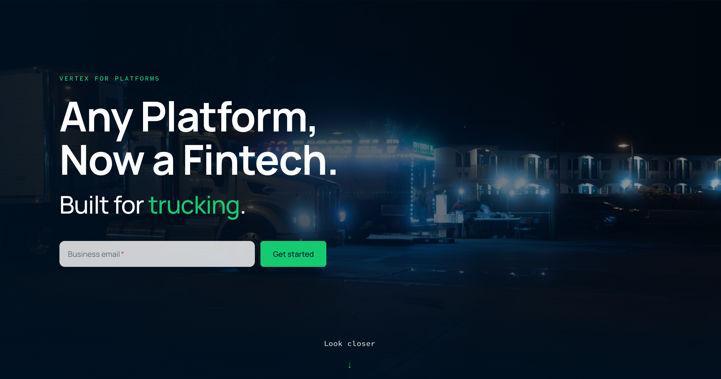
Designed a full campaign platform for Vertex, a fictional global payments infrastructure company I created for this project, built around the idea that any platform business can offer financial services without becoming a financial company. Developed two distinct creative directions, a working interactive landing page, a paid social system, and a full stakeholder presentation.
Role: Creative Lead, sole designer
Scope: Campaign strategy, visual direction within an established brand, web design and AI-assisted front-end prototyping, paid social, presentation design
Team: Solo project
Timeline: 4 days, start to finish
Ownership: End-to-end, from concept through working prototype
Overview
Embedded finance is one of the fastest growing categories in B2B tech, but it's also one of the hardest to make feel human. The product is infrastructure. It lives underneath someone else's platform, doing its job without ever wanting to be seen.
I took that on as a challenge for myself: could I make invisible infrastructure feel like something worth getting excited about, to an audience that isn't thinking about payments at all?
I built this as a self-directed project to push myself into a category I hadn't designed for before, and to have a piece in my portfolio that shows the full range I bring to a campaign, from strategic concept, through visual direction within an established brand, through working front-end execution, using the same AI-native process I use in my day to day work.
The Brief I Set
Design a campaign for Vertex, a fictional global payments platform positioned around one idea: any platform, now a fintech, no need to become a bank
Work within Vertex's existing brand identity and logo, treating them as a given rather than something to design
Speak to non-technical, non-financial decision-makers at platform businesses, without losing credibility with the technical evaluators reviewing in parallel
Make a fundamentally invisible product feel tangible and worth paying attention to
Build something interactive, not just a static campaign, that could actually demonstrate the idea rather than just describe it
Approach
I started by asking what makes this category hard to sell. Most infrastructure companies lean on being trustworthy and technical, which is necessary but forgettable. I wanted to find the emotional version of that same idea, the feeling of a business becoming something bigger than it thought it could be.
From there I developed two distinct visual directions, not as a formality, but because I genuinely didn't know which register would work better and wanted to find out by building both.
Foundation took a quieter, architectural approach. Grid-based layouts, structural typography, a lot of restraint. The idea was to make the product feel like something solid you build on top of, both literally and visually.
Momentum went the opposite way. Bolder color, more energy, layouts built around motion and transformation. This direction leaned into the emotional payoff of the idea, a business becoming something new.
I ultimately built the full system out in the Momentum direction, because it did more work to make an abstract product feel exciting rather than just credible.
The Interactive Centerpiece
The hardest problem to solve was how to make invisible infrastructure visible without resorting to a diagram. Diagrams explain a product. They don't make you feel anything about it.
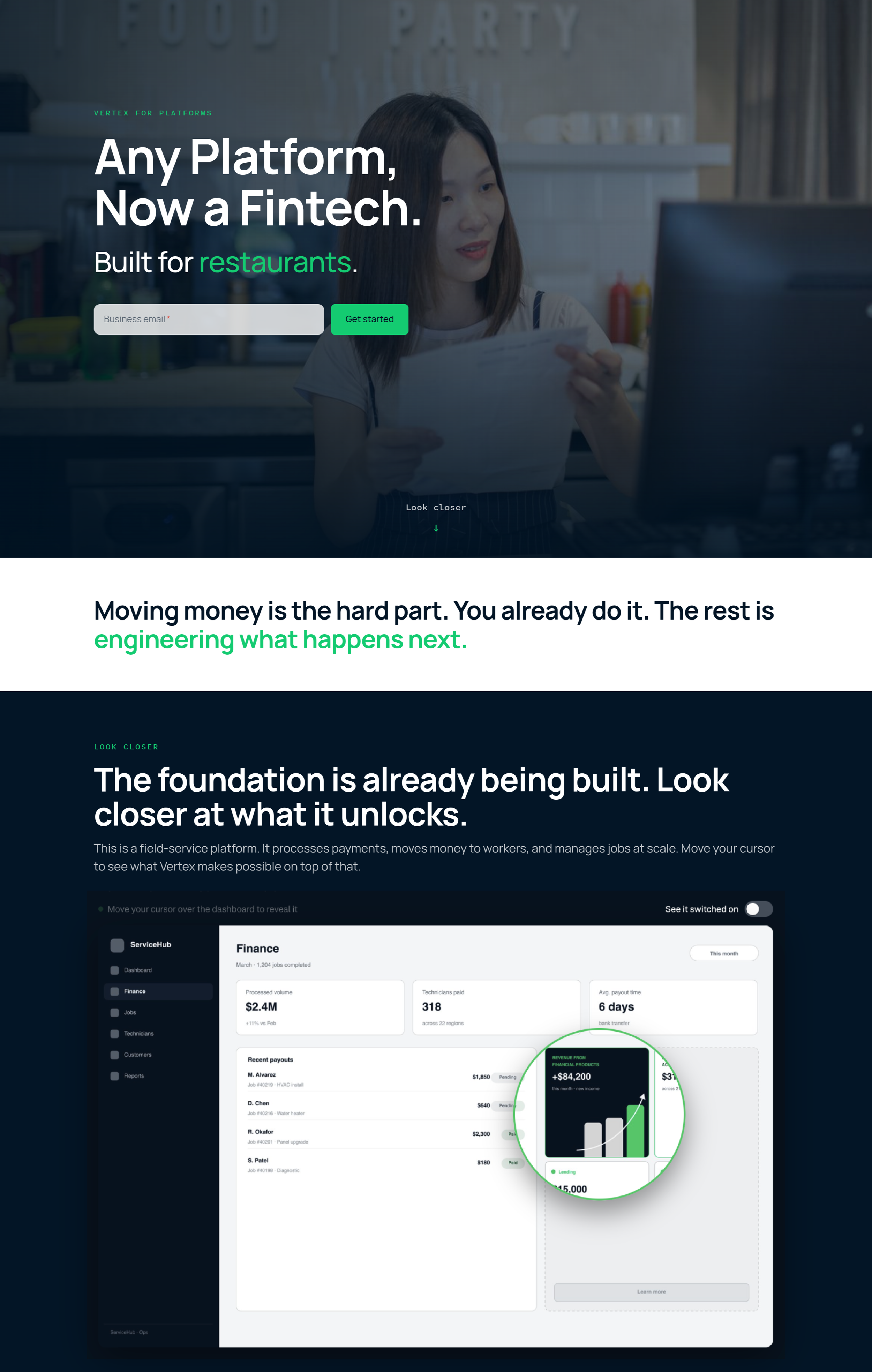
I designed an interactive reveal mechanic for the landing page: a magnifying glass the visitor drags across a mockup of a platform's own product interface, revealing the payments infrastructure working underneath. The platform's UI stays exactly as its users would see it. Dragging the magnifying glass peels back that layer to show what's actually powering the transaction underneath, all without the platform ever having to build or brand any of it themselves.
The goal was to let someone feel the idea in about five seconds of interaction, instead of reading three paragraphs about embedded infrastructure.
I built the interaction myself using AI-assisted front-end development, the same process I use for client web work day to day. That meant I could go from concept sketch to a working, draggable prototype without waiting on a developer, and iterate on the feel of the interaction directly rather than describing it in a spec.
Look at the live landing page prototype here.Building the Full System
Once the core idea and interaction were working, I built out the rest of the campaign to show how it would extend across channels.
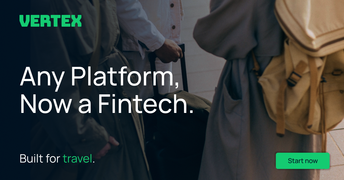
I designed the landing page to carry the interaction as its centerpiece, with supporting sections that translate the same idea into more direct product language for anyone who scrolls past the interactive moment wanting the straightforward pitch. The paid social system pulled from the same visual language, adapted for LinkedIn's format and for an audience that's scrolling fast and needs the idea to land in under a second.
Presenting the Work
Because this was built as a stand-in for a real stakeholder review, I put together a full presentation deck with speaking notes, treating it the way I would an actual client or leadership presentation. That meant being ready to explain not just what I made, but why I made it, and being able to defend the choice of Momentum over Foundation with a real strategic argument rather than a preference.
What This Demonstrates
Bringing strong visual direction and a working campaign system to life within an established brand, rather than needing to define the brand itself first
Translating a technical, largely invisible product into a campaign idea that's actually emotionally legible
Developing and defending two genuinely different creative directions from the same strategic insight, rather than one direction with two color options
Using an AI-native process to move from concept to a working interactive prototype myself, without handing it off to a developer
Structuring and presenting a full stakeholder narrative, from brief through execution through outcome
What I'd Push Further With More Time
Given more runway, I'd want to build out a second interactive moment further down the landing page, something that lets a visitor explore a use case specific to their own type of platform rather than a single generic demonstration. I'd also want to test both directions with real audience feedback rather than making the Momentum call on instinct alone.
This is a self-directed conceptual project built to explore campaign design for Vertex, a fictional embedded payments platform. It does not represent commissioned client work.