Website Refresh

OVERVIEW
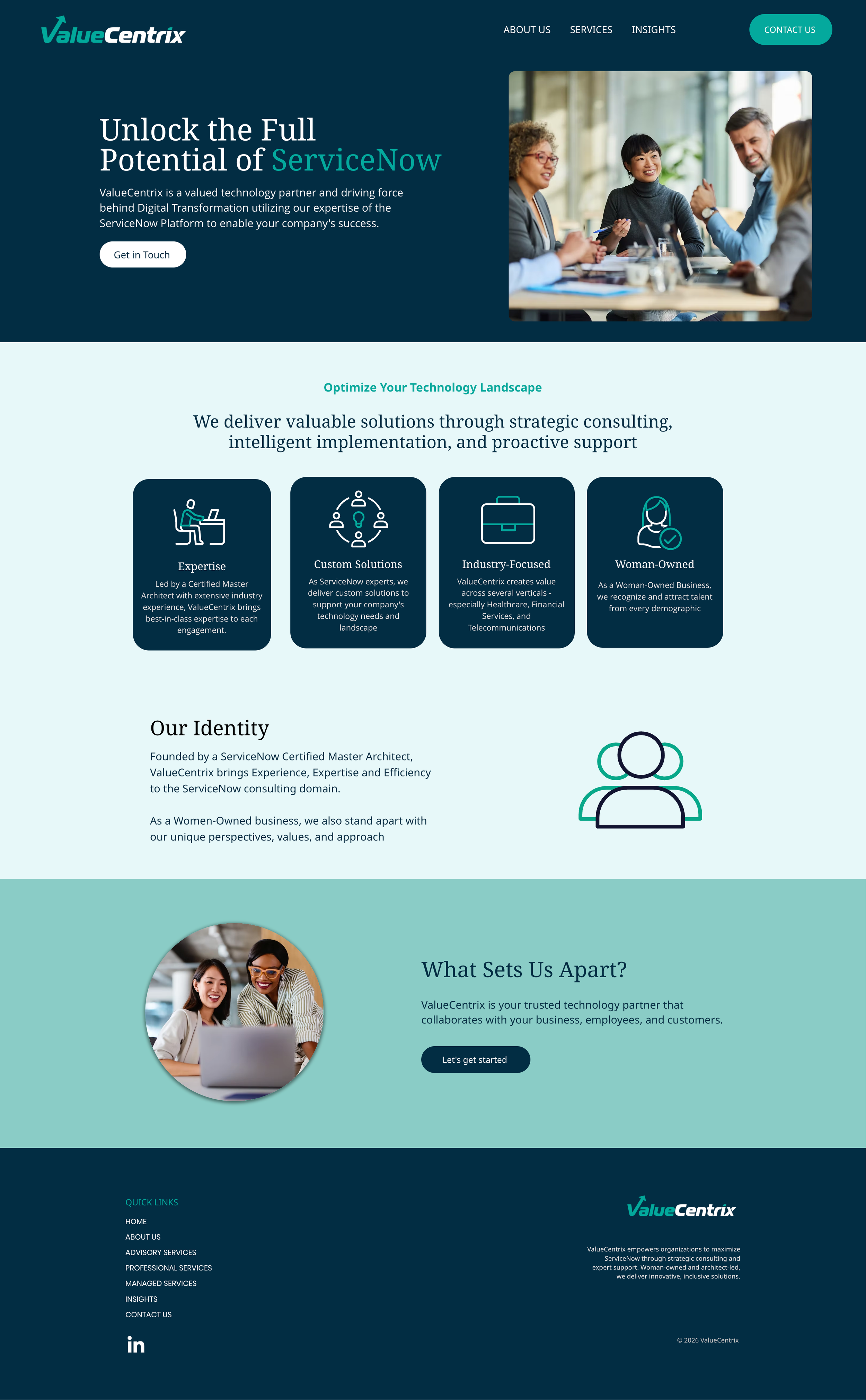
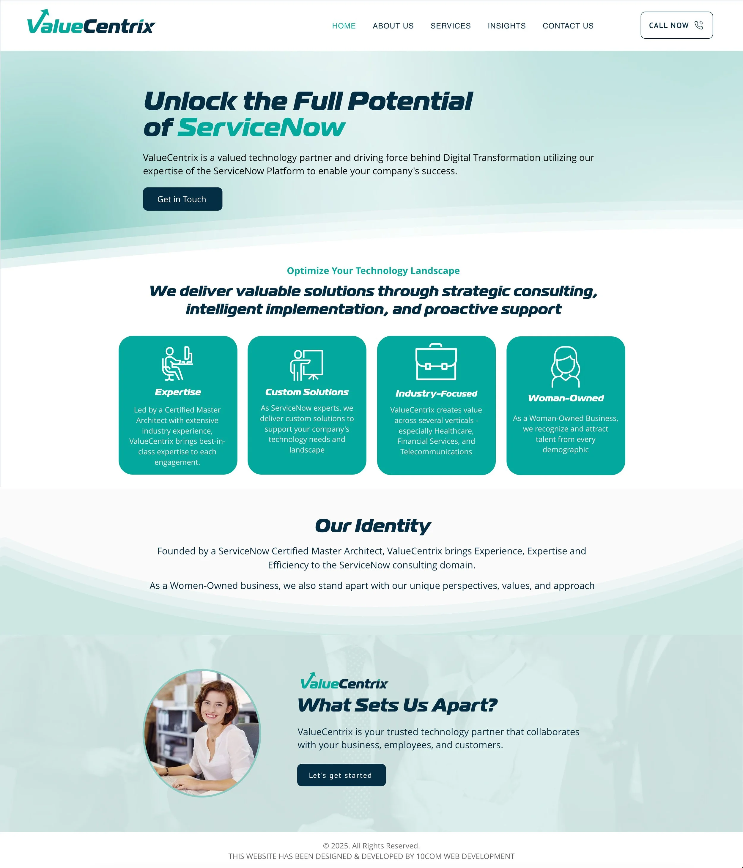
A ServiceNow partner competing in a field of 1,300+ firms needed a website that matched the caliber of their work. Their existing site — built in Wix — relied on generic layouts, inconsistent visual design, and service pages that failed to communicate their differentiation or drive conversions.
Working within the constraints of their CMS and a limited budget, I led the end-to-end visual redesign: from brand expression and UX improvements to scalable page templates and client-facing project management.
Role & Ownership
Web Designer · Brand Designer · UX/UI · Project Manager · Client Liaison
Constraints
Wix CMS with limited design flexibility and no custom development
Tight budget with no room for platform migration or engineering support
Existing brand elements needed to be honored and evolved, not replaced
Timeline ran parallel to other active client projects
What I Did
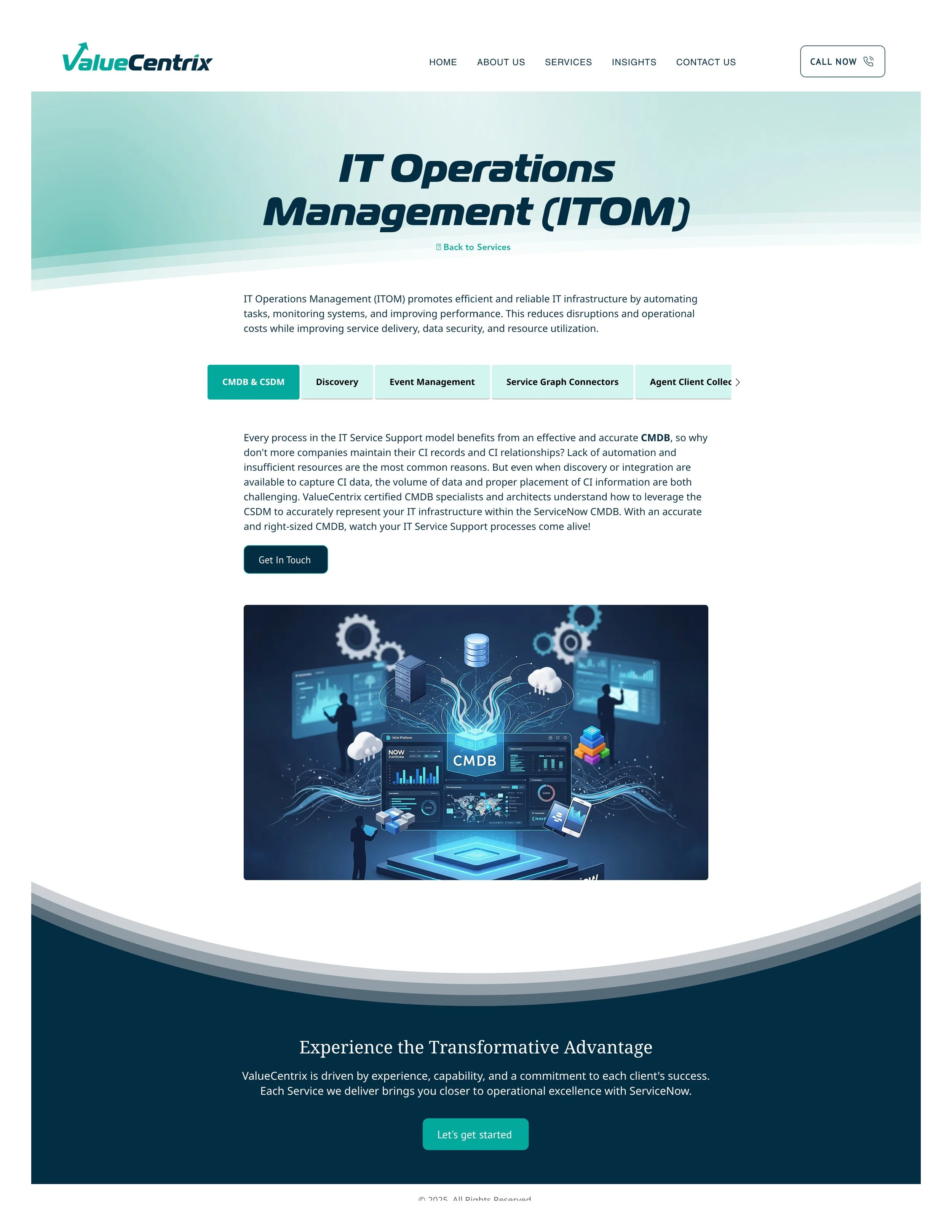
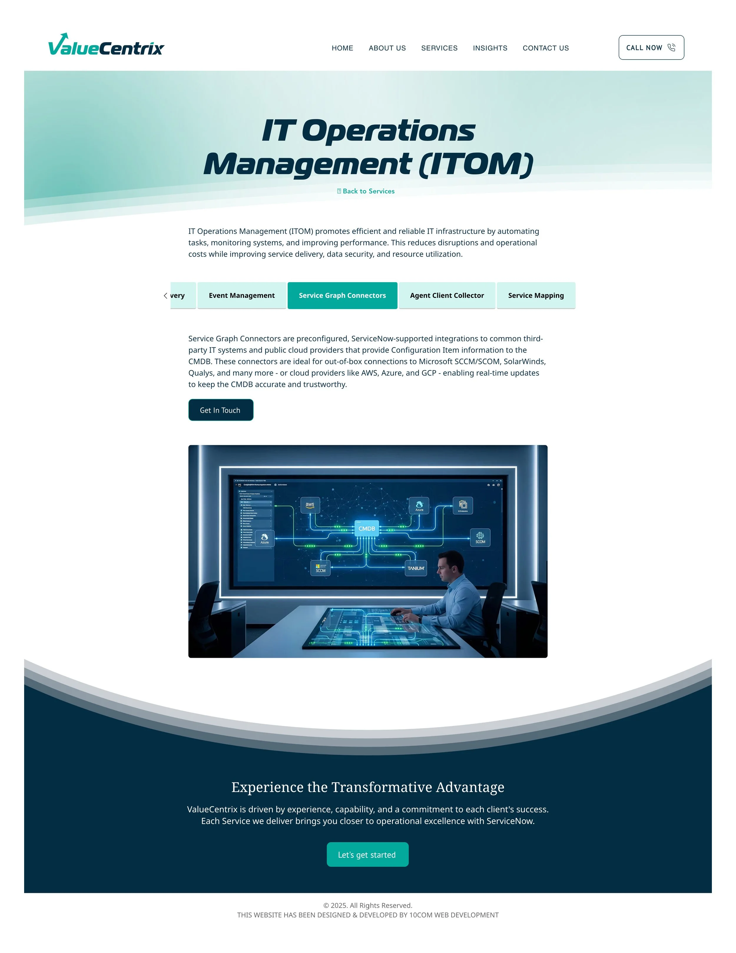
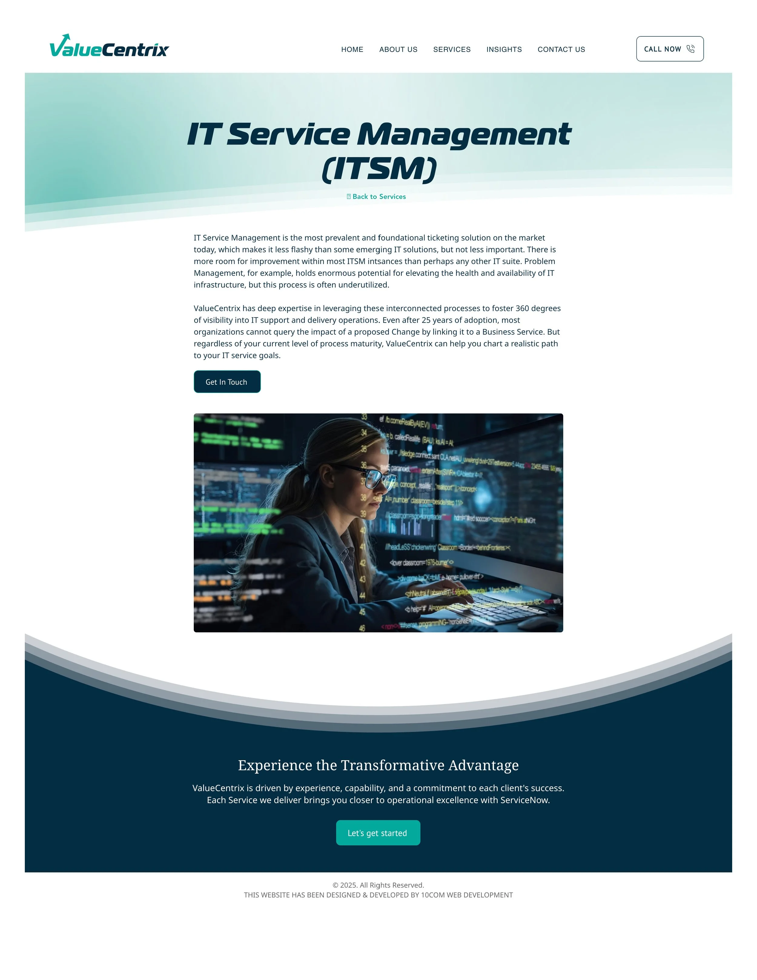
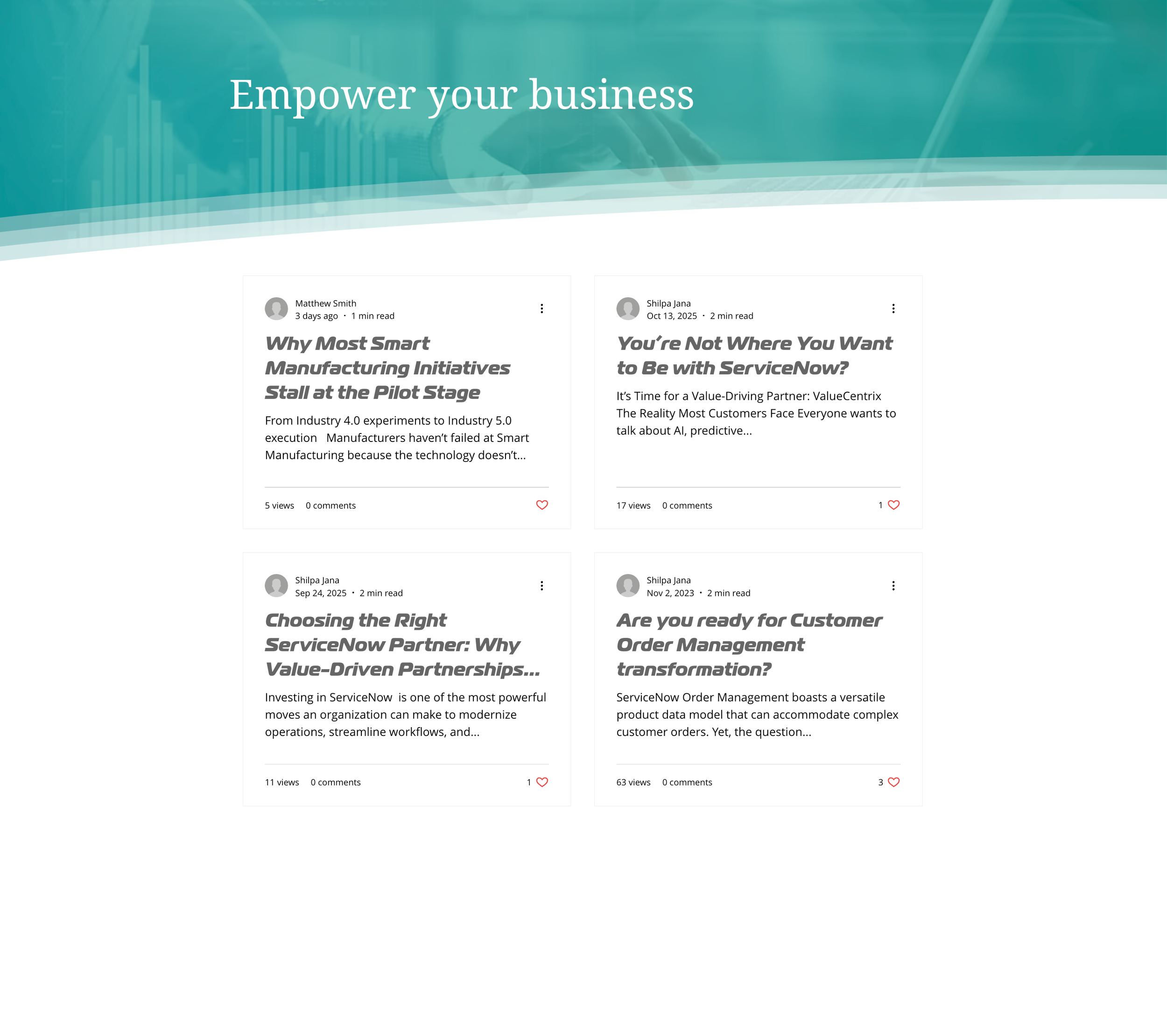
Visual Design & Brand Refresh Modernized the site's visual language across every page — updating typography, color application, layout structure, and visual hierarchy. Sourced and curated photography and iconography that elevated the brand from generic tech partner to enterprise-grade firm.
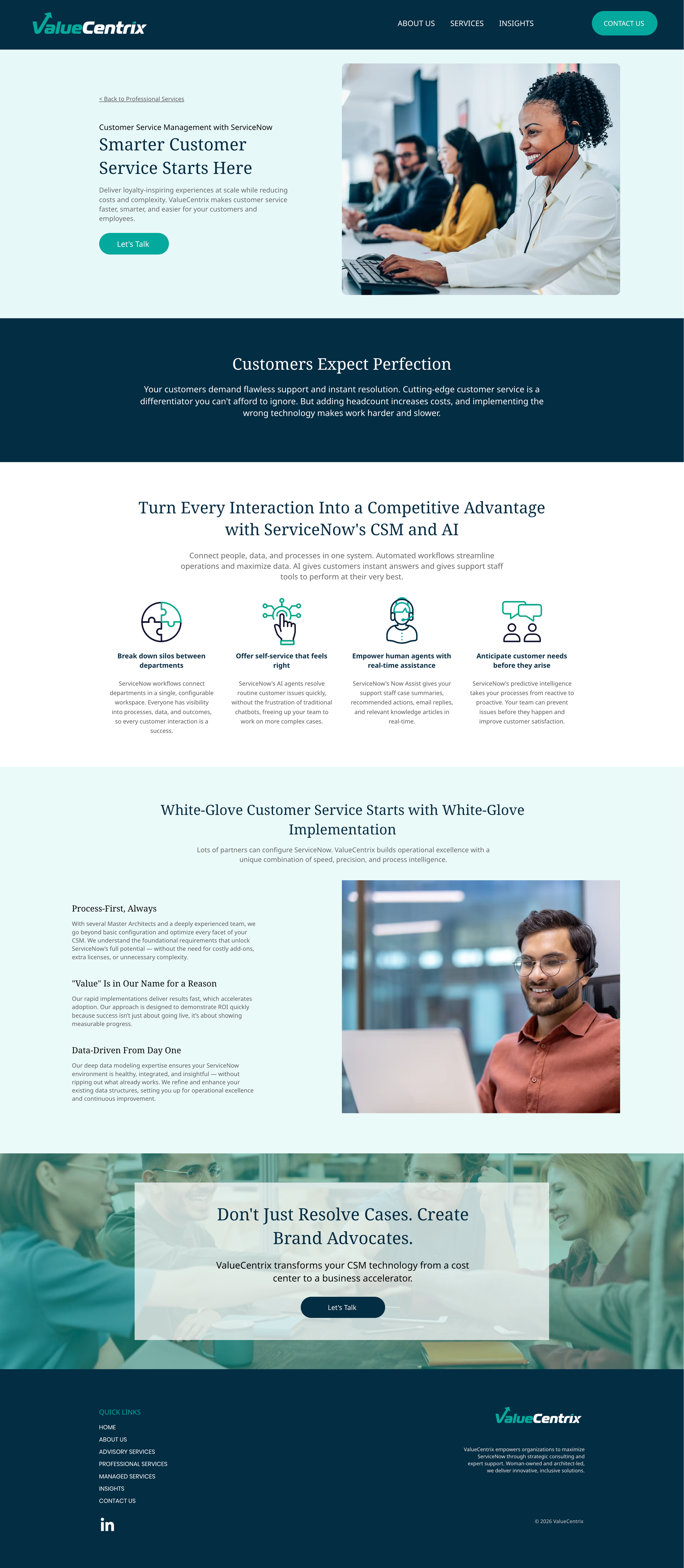
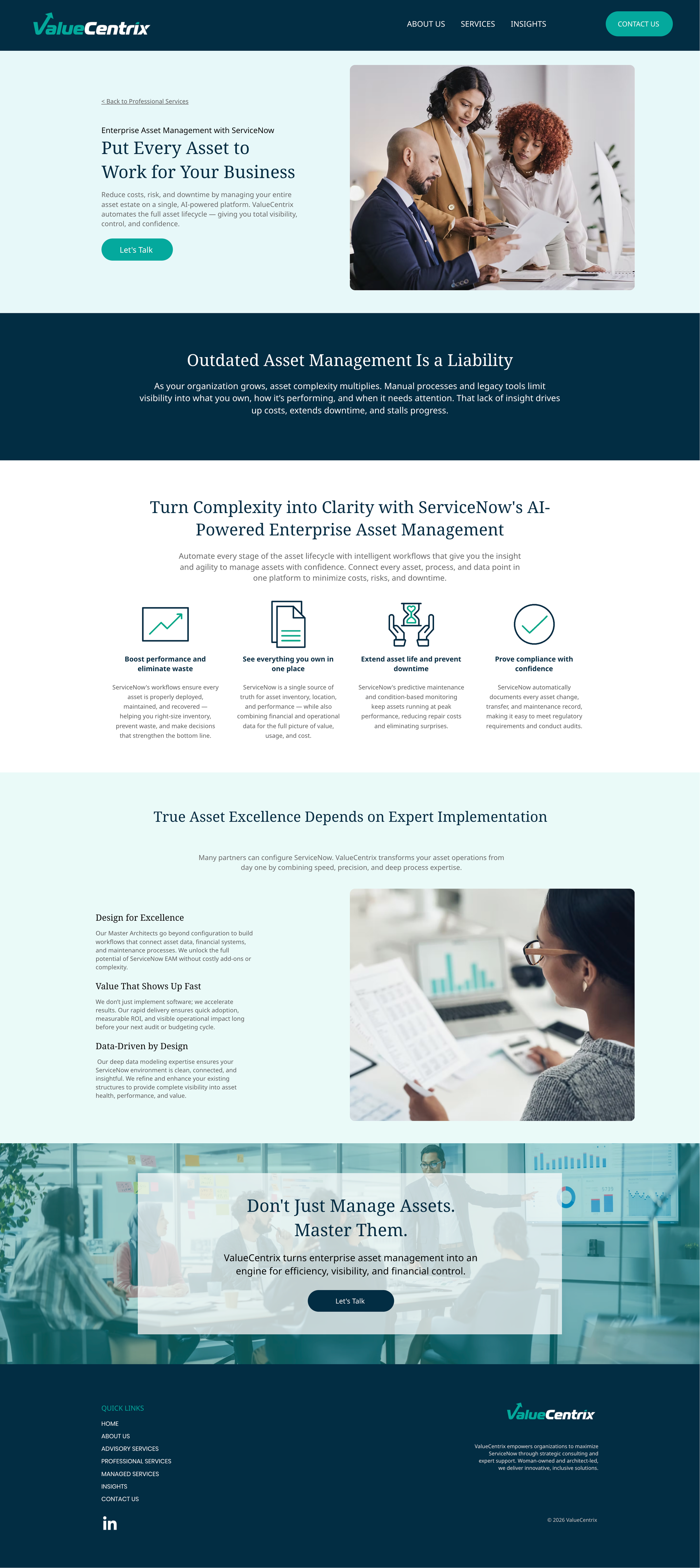
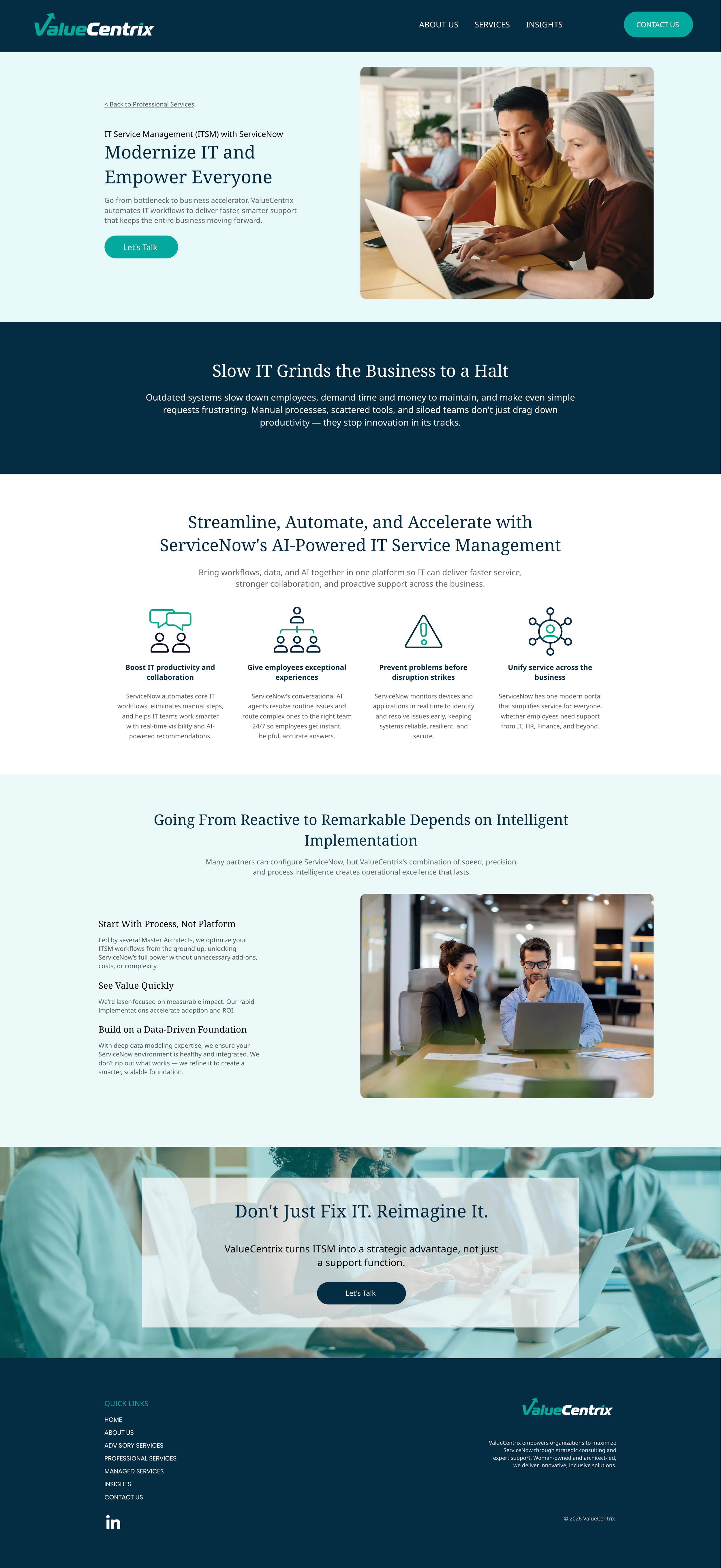
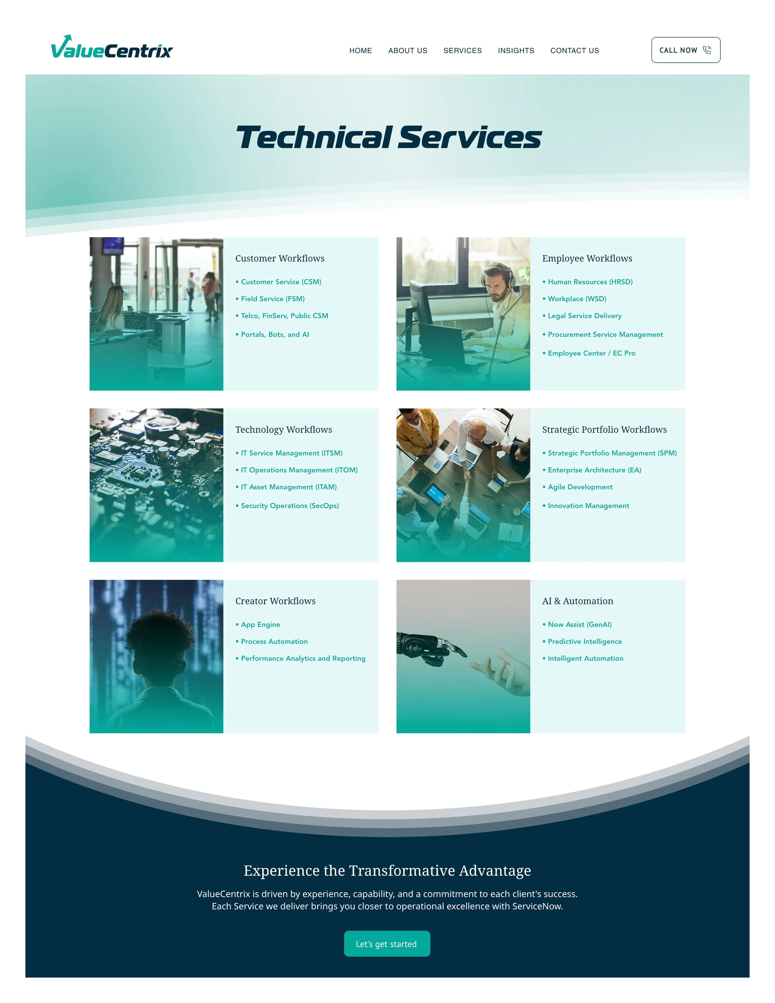
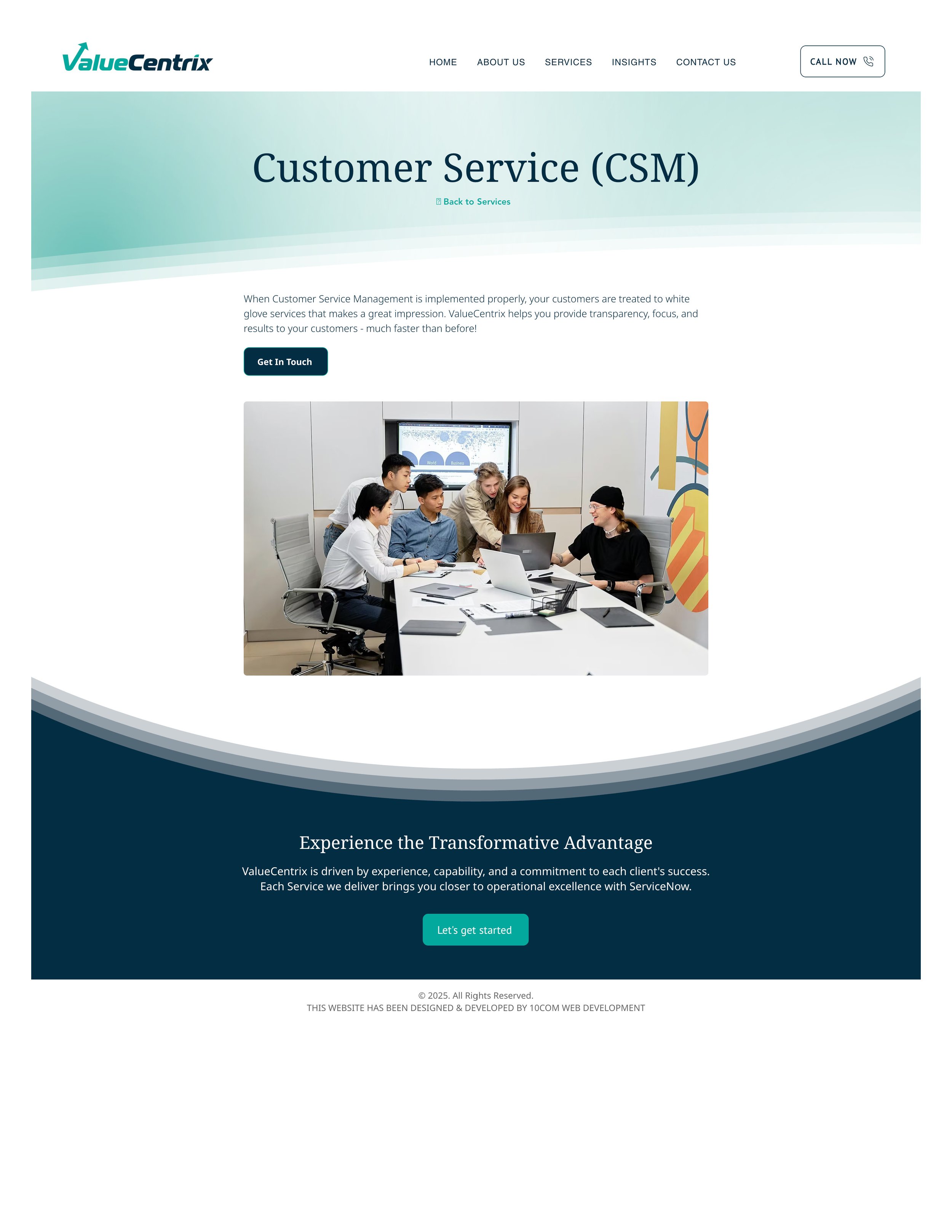
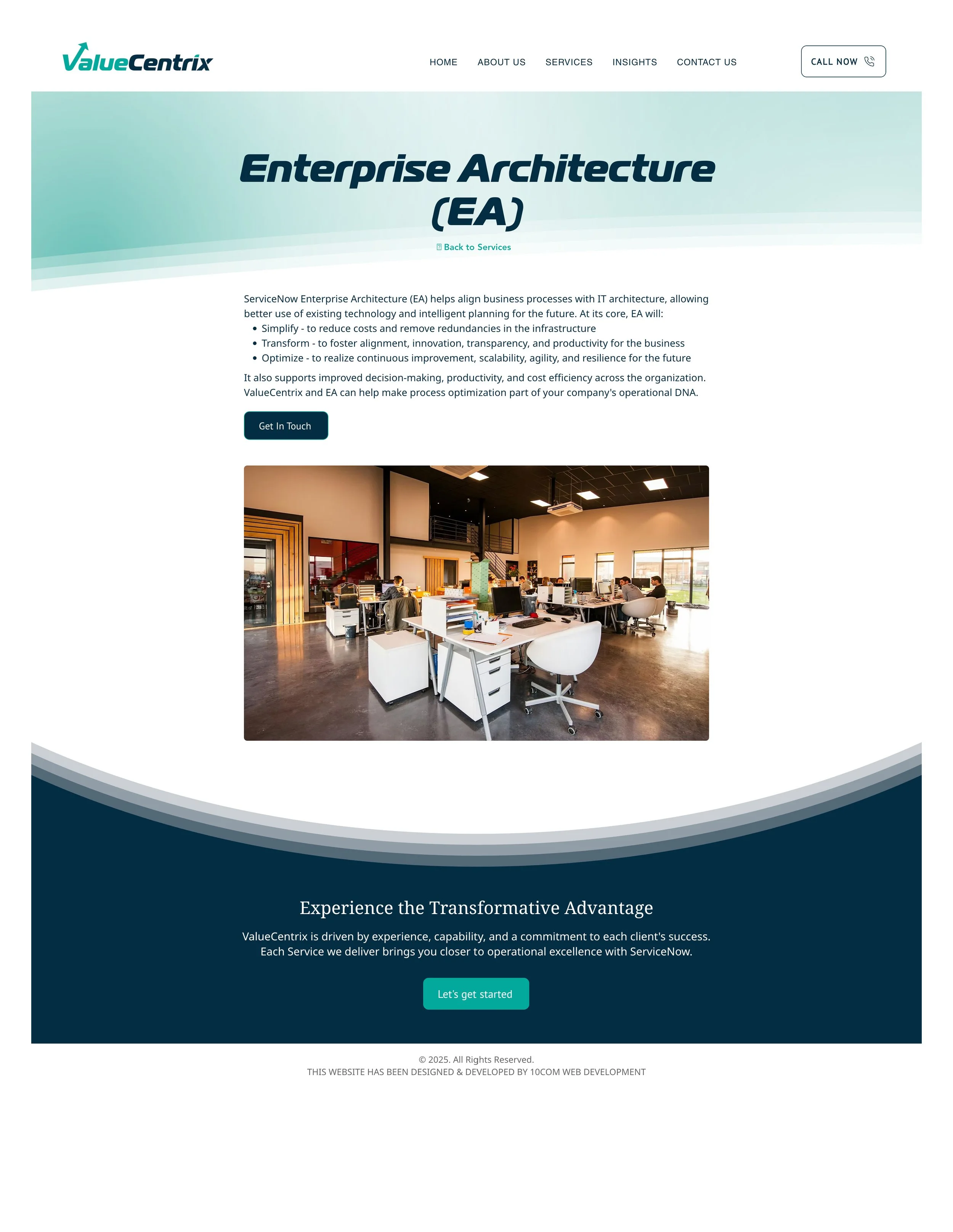
Scalable Page System Designed a reusable service page template and modular layout components that allow the client to build new pages independently without starting from scratch. This gave them a foundation to grow their site well beyond the scope of our engagement.
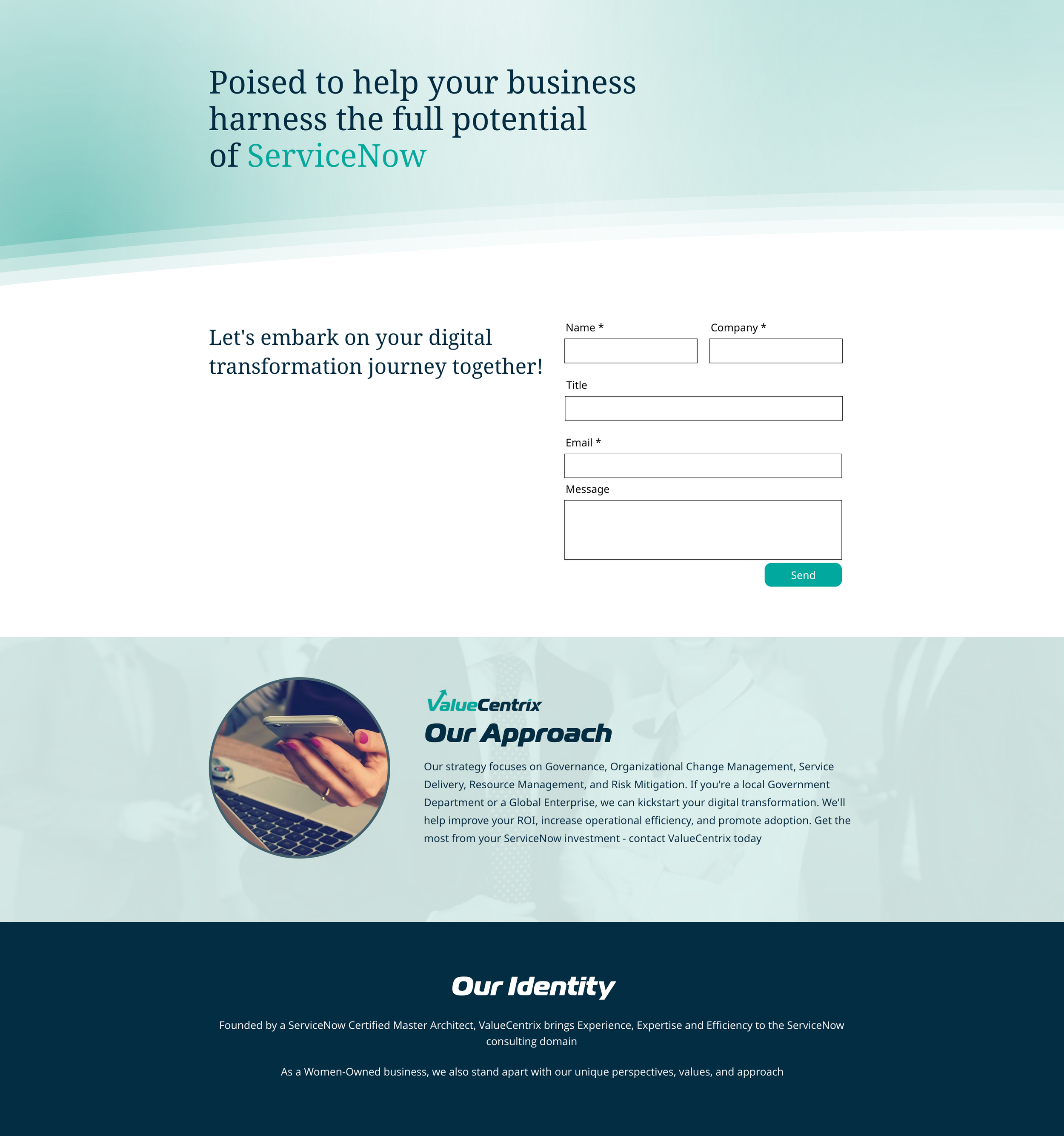
UX & Layout Improvements Restructured the information architecture and page layouts to guide visitors more effectively — clearer calls to action, stronger content hierarchy, and more intentional use of white space and motion cues.
Header, Footer & Global Elements Redesigned global site components — including navigation, headers, and footers — to create consistency and cohesion across all pages.
Client Communication & Project Management Served as the primary design point of contact with the client's CEO. Managed project timelines, feedback cycles, and deliverables while collaborating closely with a content strategist to align design with messaging strategy.
Design Advisory Provided strategic recommendations for long-term improvements beyond the immediate project scope — including platform considerations, accessibility improvements, and conversion optimization — helping the client make informed decisions even under budget constraints.
Result
The refreshed site delivers a modern, credible digital presence that repositions the client from a transactional implementer to a strategic transformation partner. The modular design system means the site can grow and evolve without requiring a full redesign.

What I'd Do Differently with More Resources
With a more flexible CMS, I would have pushed further on animation, responsive behavior, and conversion-focused layout testing. Several design recommendations I made were technically out of scope for Wix — I documented these for the client as a roadmap for future investment.
IMAGES FROM BEFORE WEB REFRESH
I wrote about the strategic case for a web refresh over a full redesign — read it here.