Website Refresh to Improve Brand Clarity and Scalable Design Systems

Website Refresh | Client work through Firebrand
Led end-to-end website refresh to improve brand clarity, usability, and scalability without a full redesign. Focused on refining visual systems, improving content hierarchy, and introducing reusable design patterns to support ongoing growth.
Role: Creative Lead and Program Owner
Scope: Website design, UX/UI, brand system refinement, CMS implementation
Team: Design and production (me), content lead, executive stakeholders, marketing team
Timeline: 4-6 weeks
Ownership: End-to-end execution from intake through launch
Overview
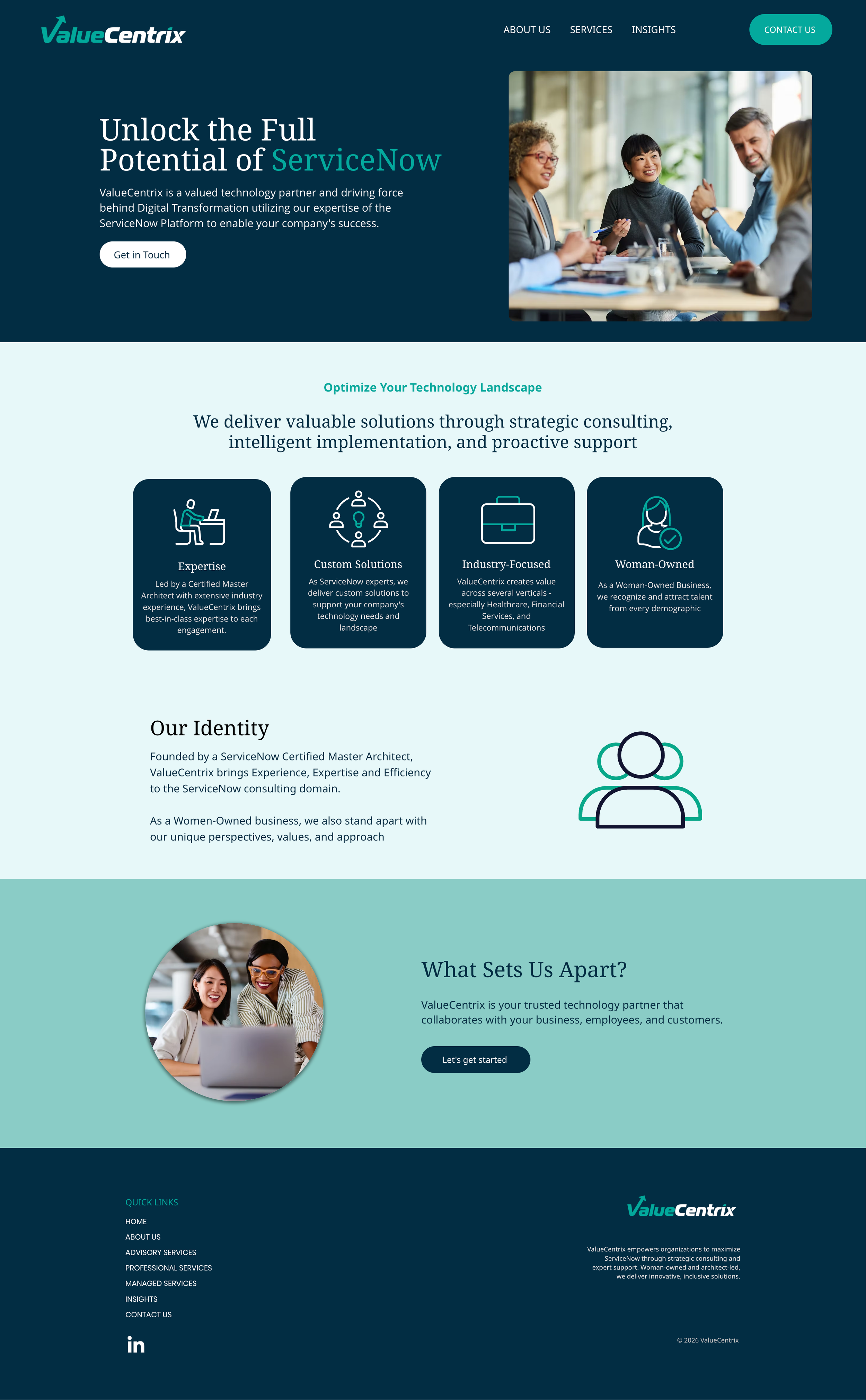
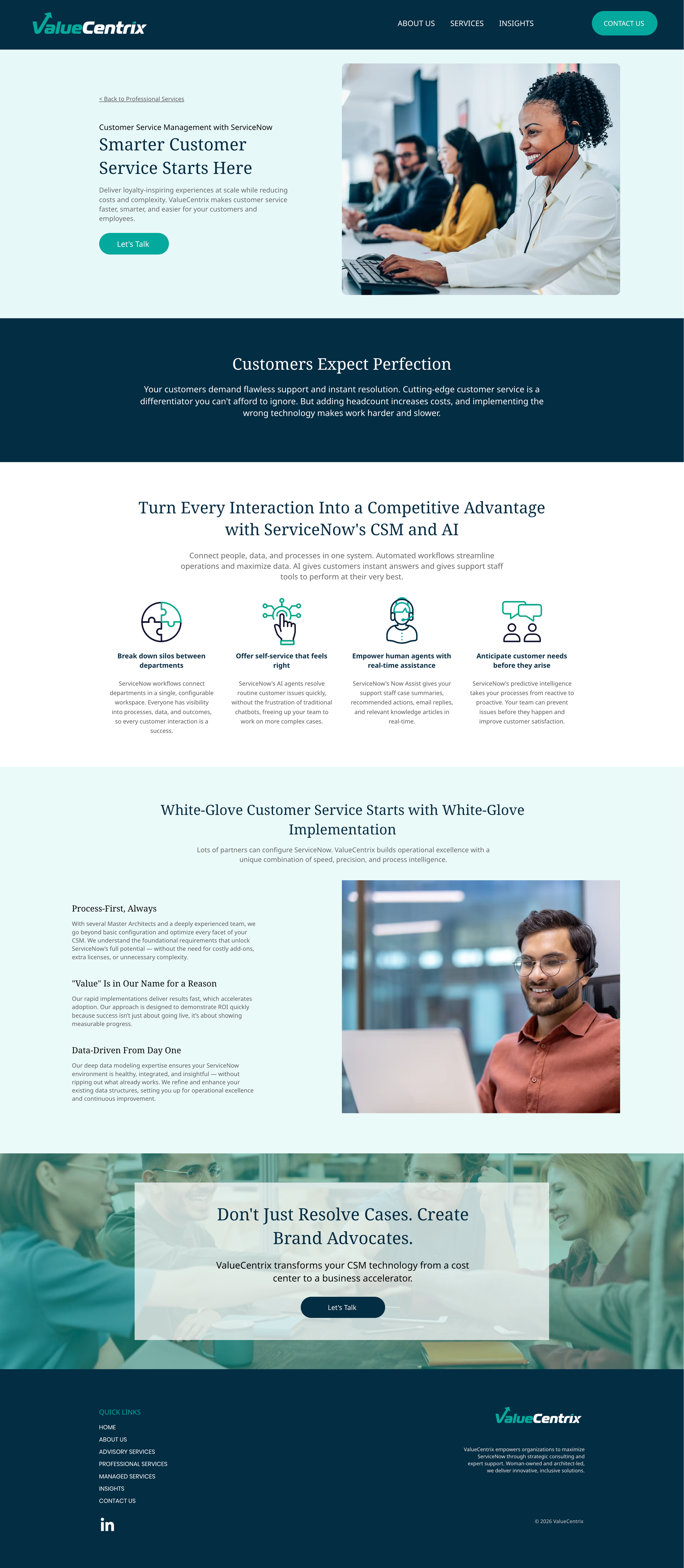
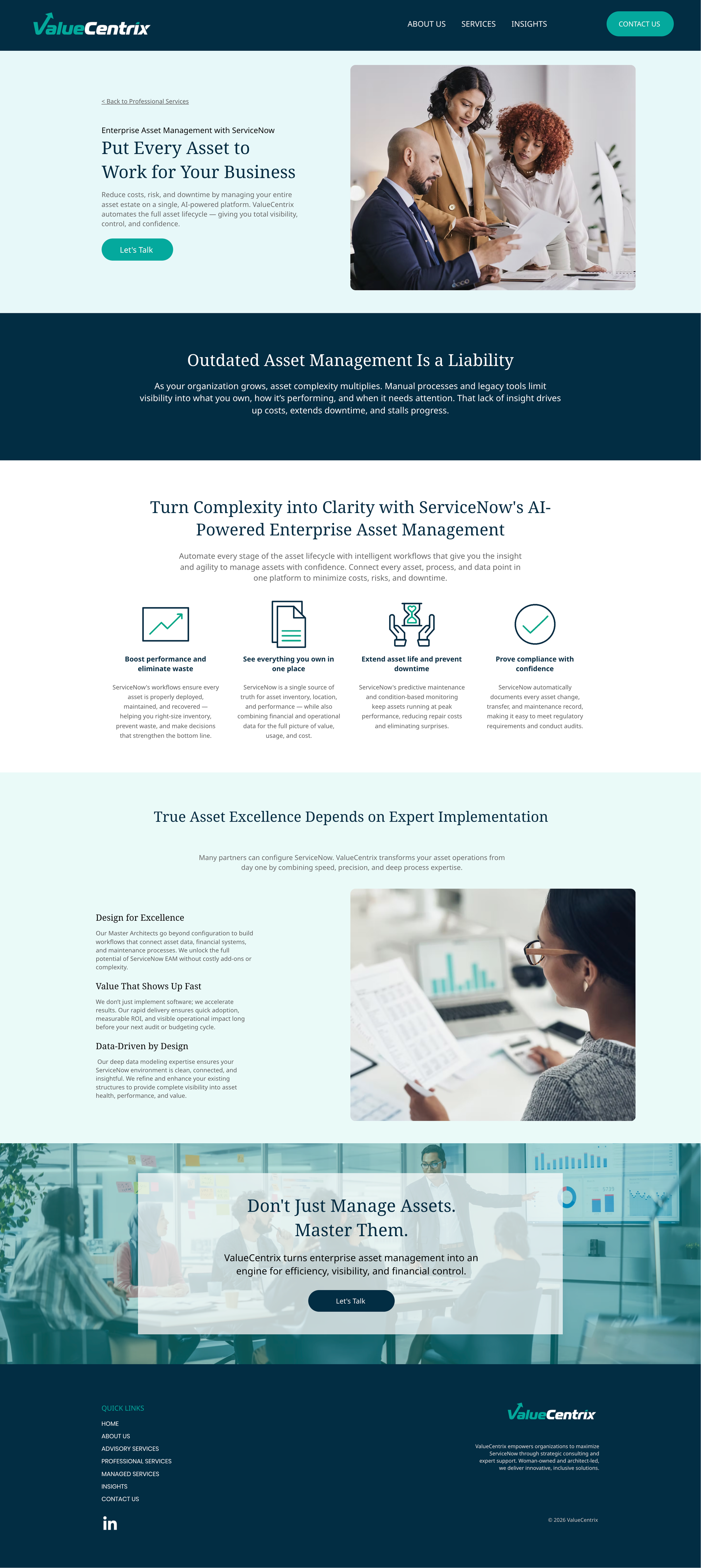
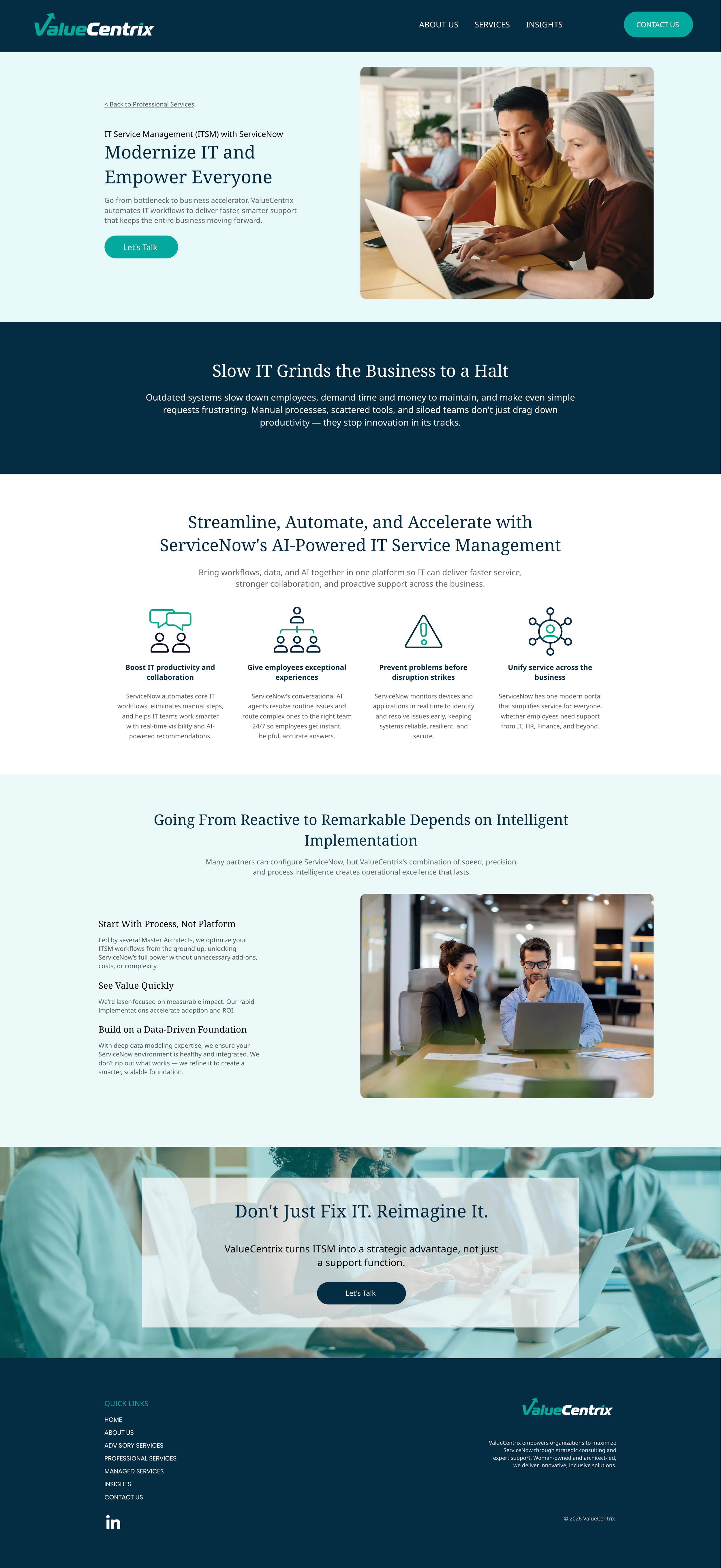
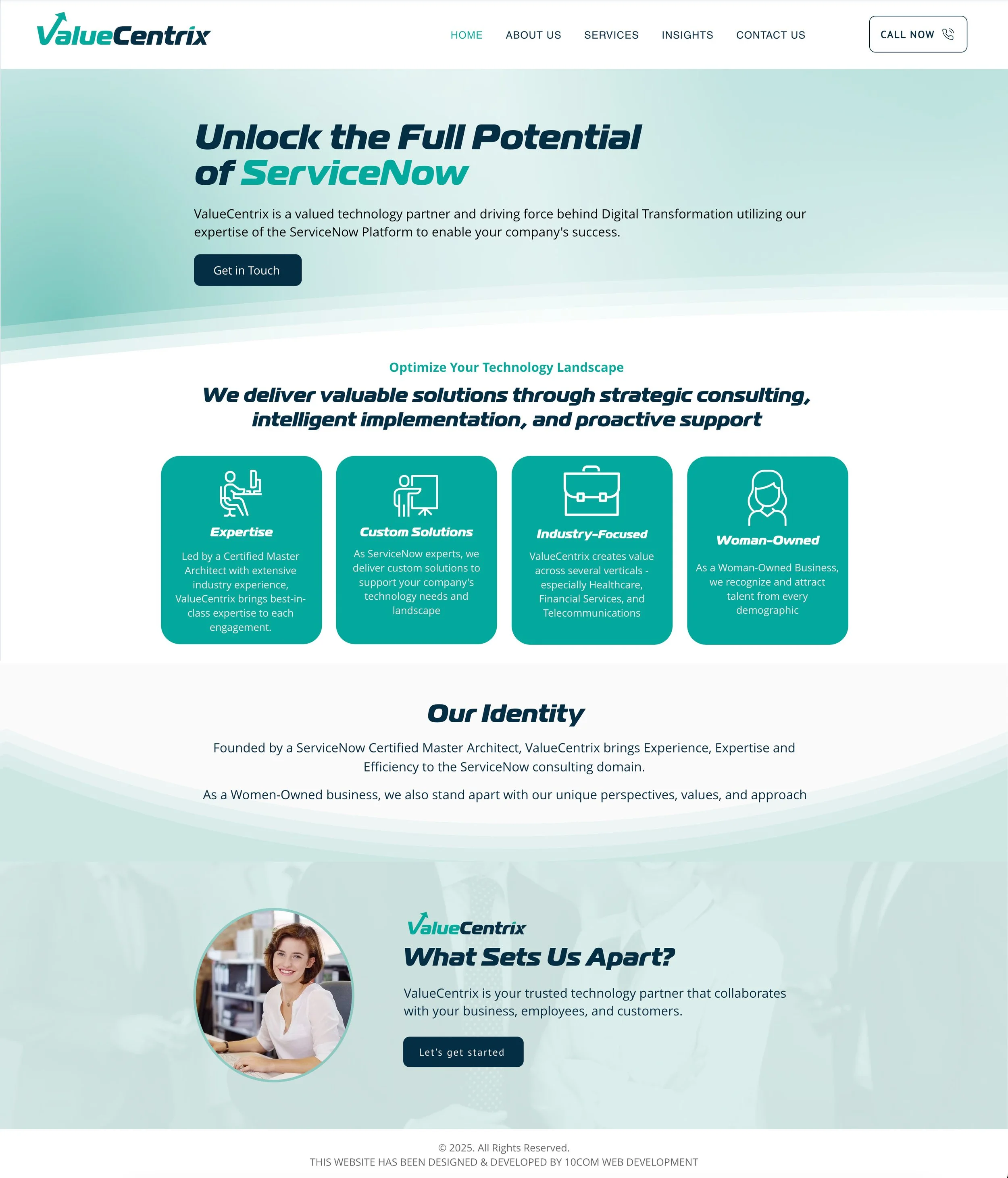
This website refresh focused on improving how the brand shows up today without starting from scratch. While the existing site had strong content and structure, the experience no longer reflected the company’s positioning or level of maturity.
The goal was to refine, not reinvent—evolving the visual system, improving clarity, and creating a more scalable foundation for future growth.
Problem
Visual system felt inconsistent across pages
Homepage did not clearly communicate positioning
Layout patterns made it difficult to scan key information
Site experience felt static and misaligned with current brand expression
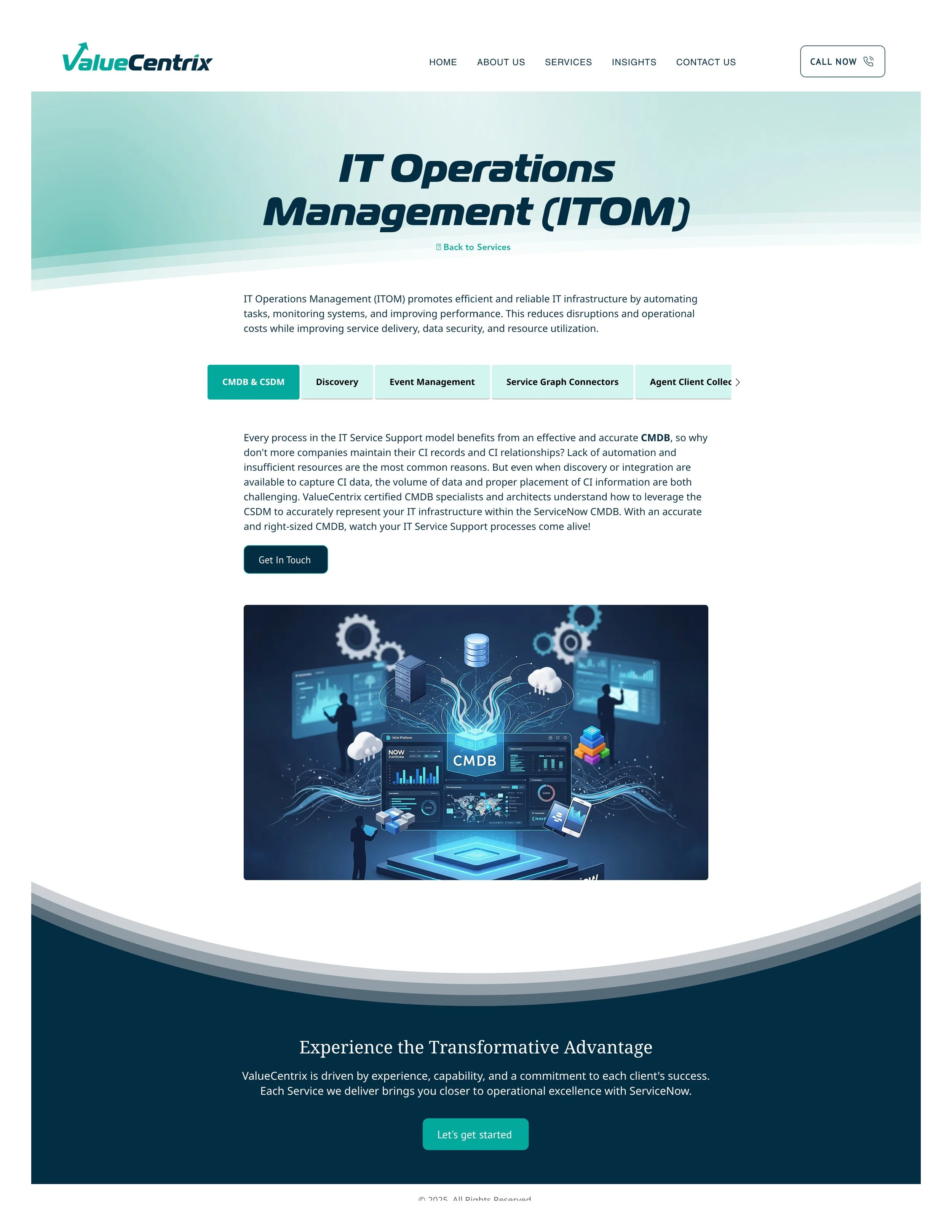
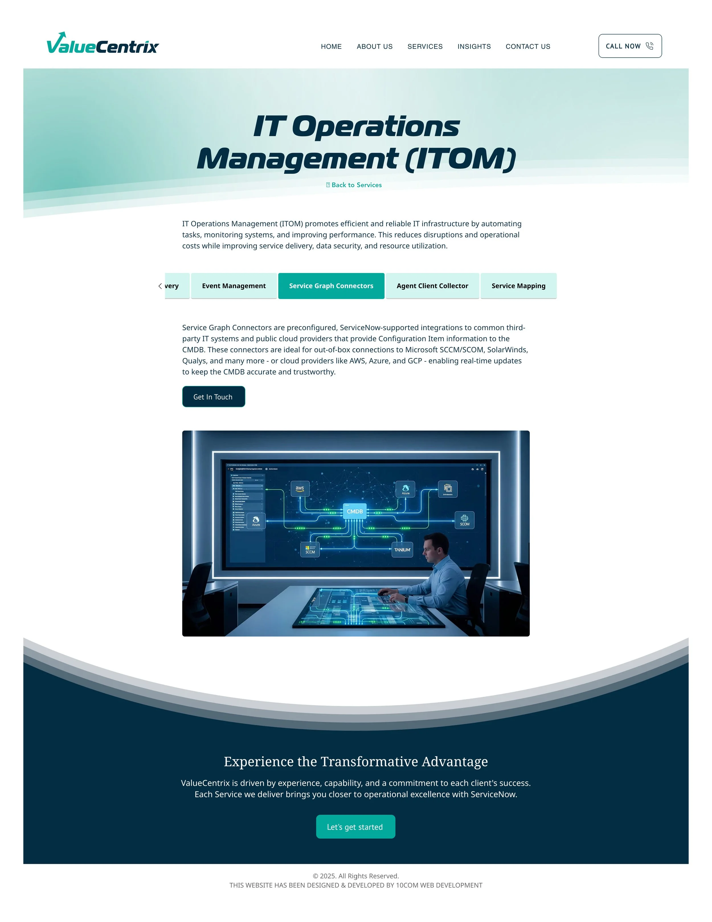
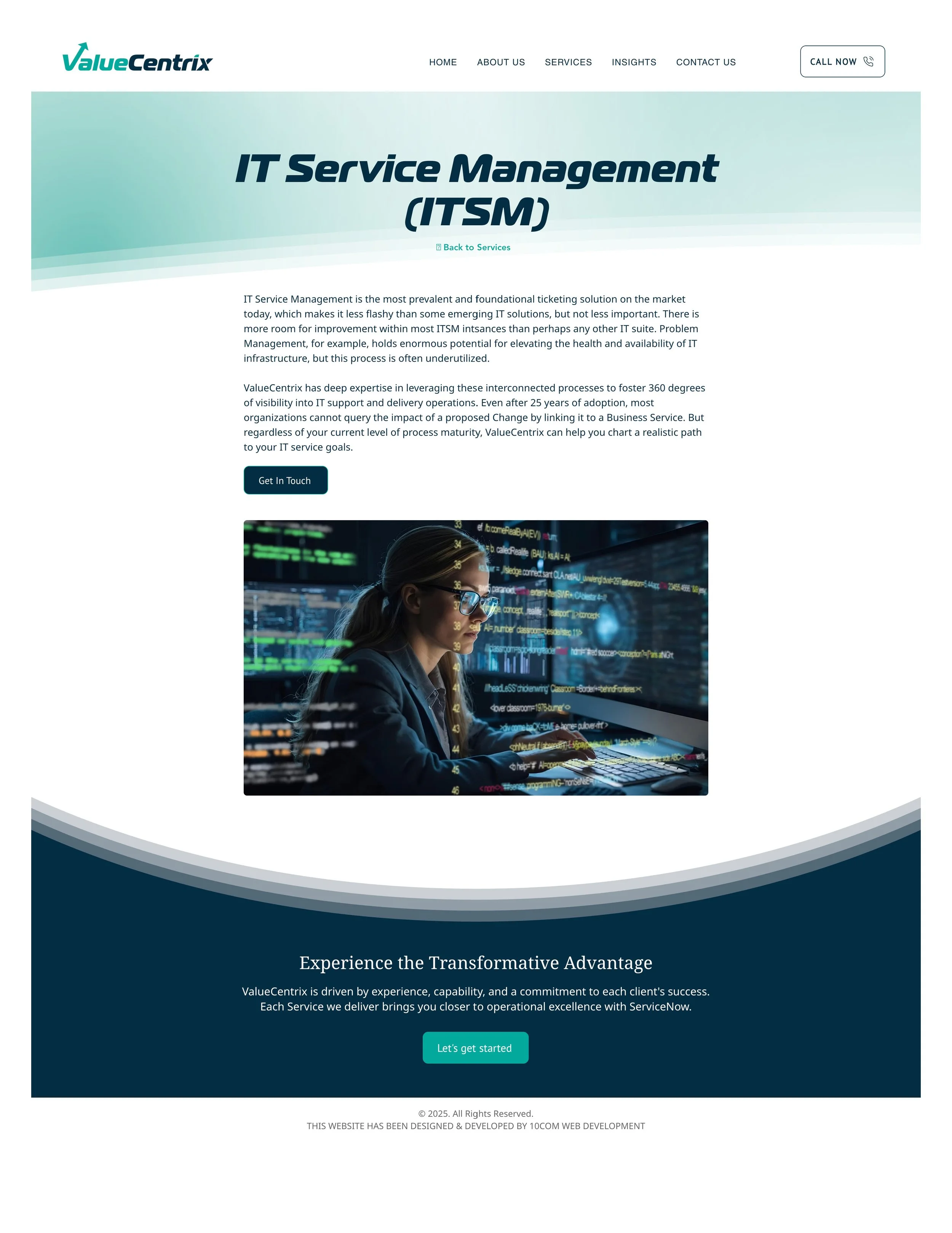
Approach
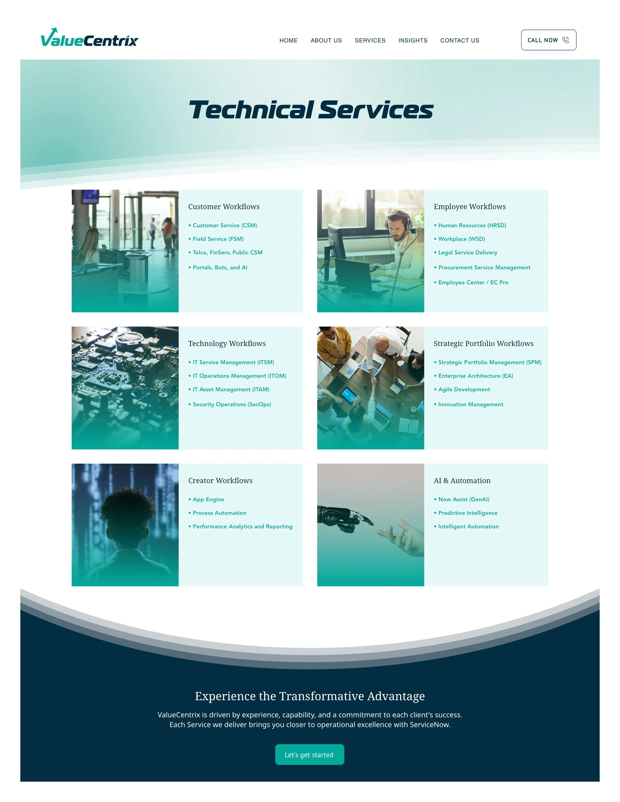
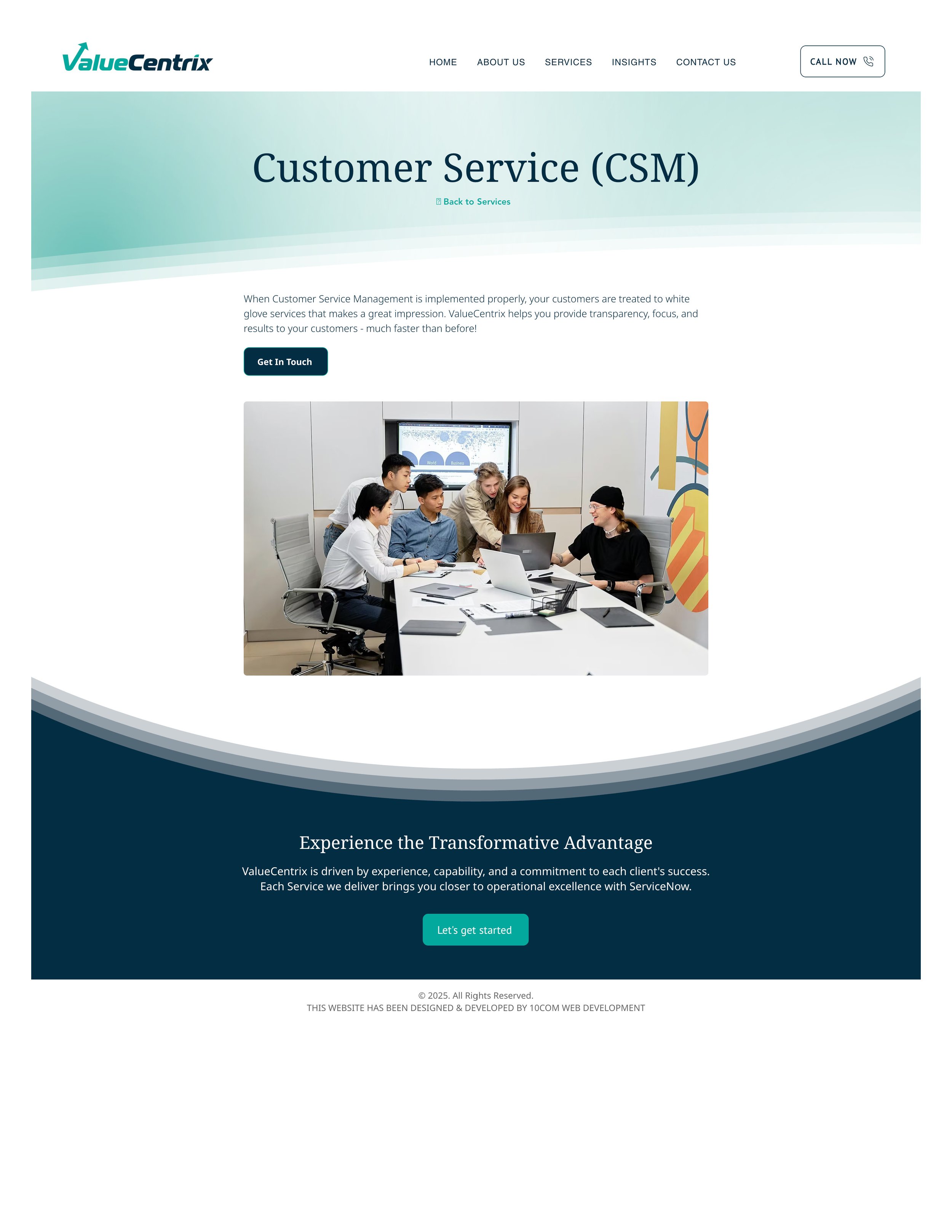
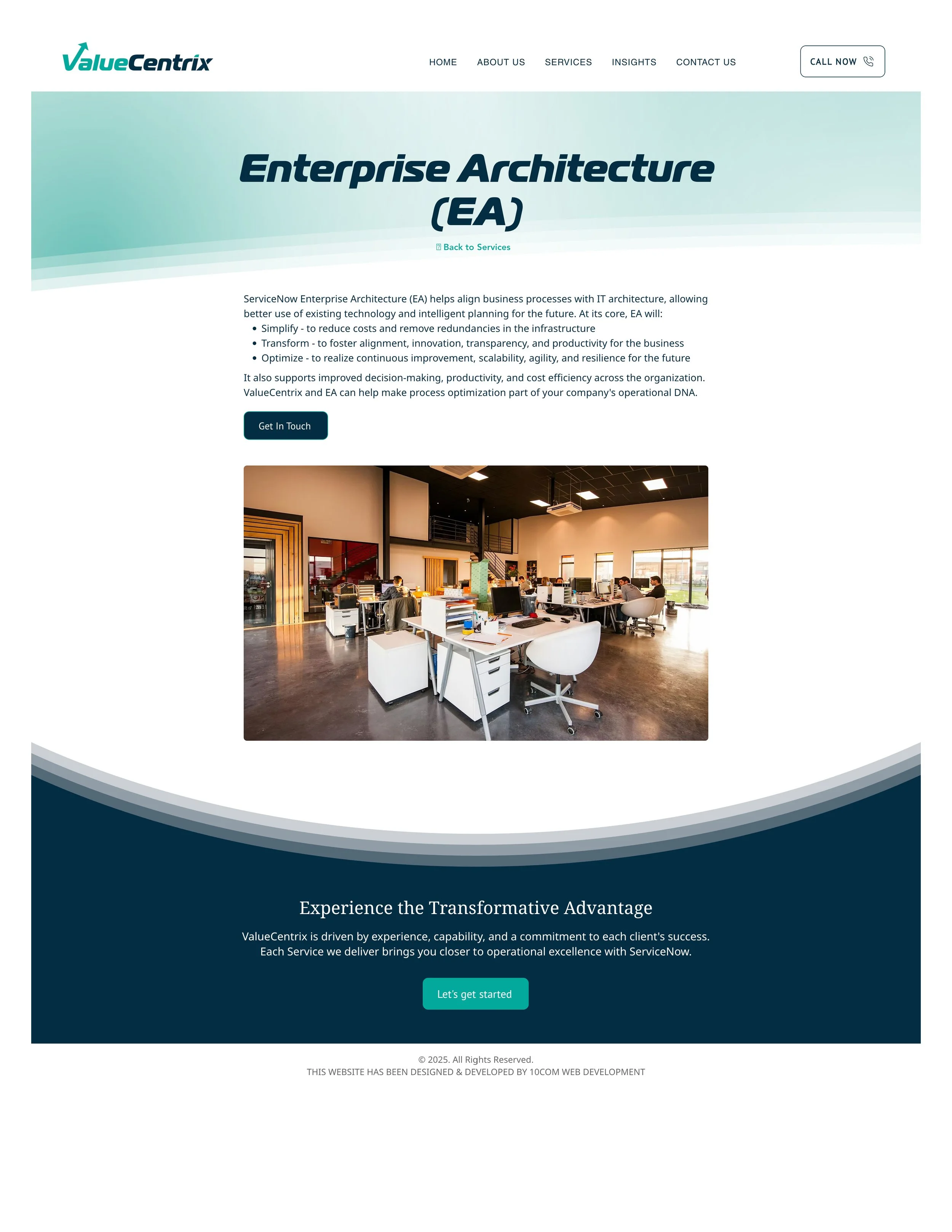
Prioritized high-impact pages rather than redesigning the full site
Introduced motion and interaction to improve engagement and flow
Refined typography, color usage, and layout patterns for consistency
Improved information hierarchy to make content easier to scan
Built reusable design patterns to support future updates and scalability
Role and Execution
Owned the project from intake through execution, aligning stakeholders on goals, scope, and priorities
Translated high-level business needs into structured design decisions and workflows
Partnered closely with developers to bring designs to life and ensure quality through QA
Balanced speed and quality in a fast-moving environment with evolving requirements
Managed ambiguity and shifting inputs while maintaining forward progress
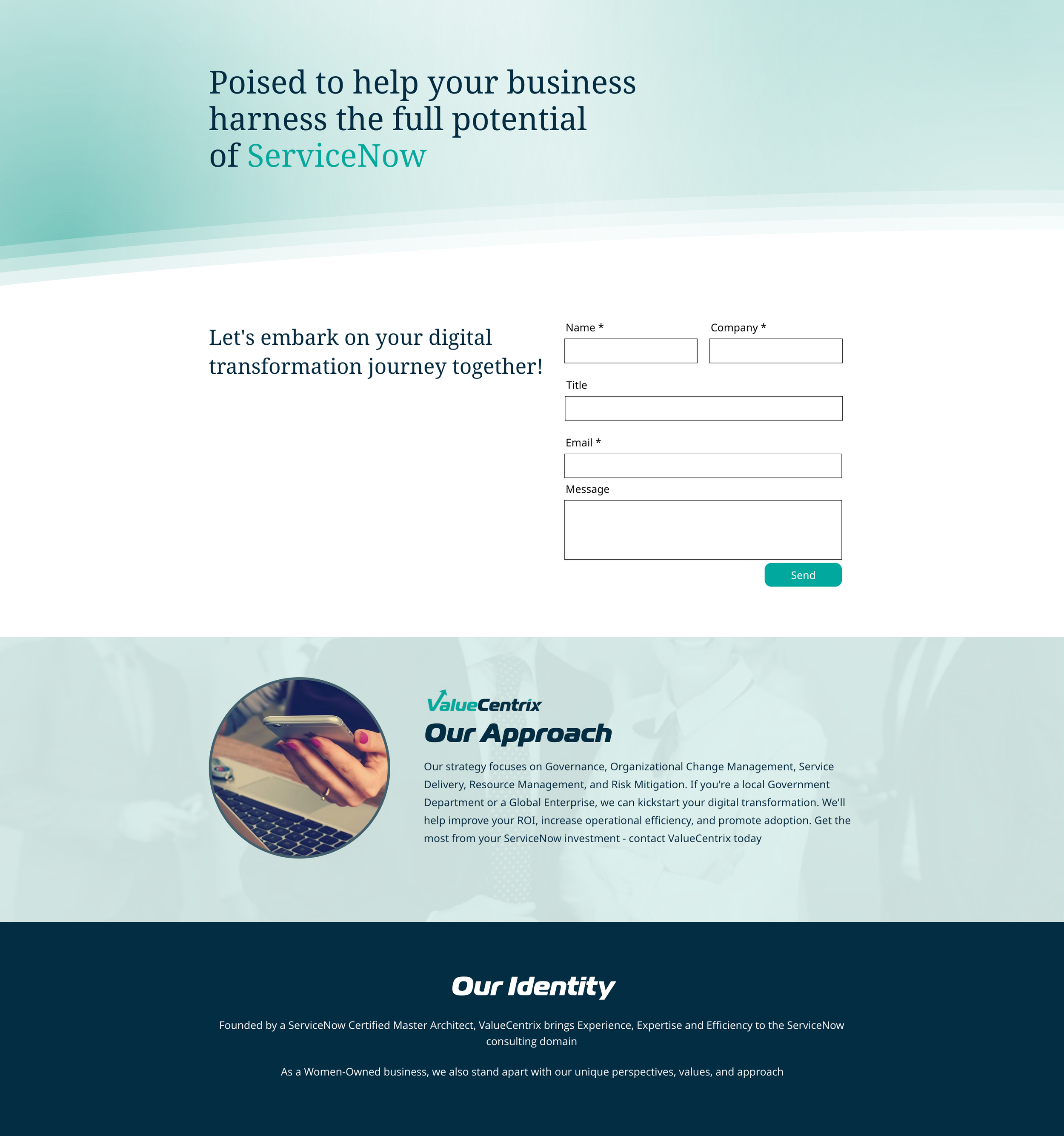
Motion and Interaction
Adding motion to the homepage improved engagement and helped communicate the brand more quickly. A hero video and subtle interactions created a more dynamic experience without changing the underlying structure.
Visual System Refinement
Typography, spacing, and color usage were refined to create a more cohesive and consistent experience across pages. These updates helped modernize the brand while staying within the existing system.
Layout and Hierarchy
Content was reorganized to improve scanability and clarity. Updated layout patterns made key information easier to find and reduced friction for users navigating the site.
Outcome
Created a more modern, cohesive brand experience without requiring a full redesign
Improved clarity of messaging and overall site usability
Established scalable design patterns that support faster and more consistent updates
Better aligned the website with how the brand shows up across marketing channels

What I'd Do Differently with More Resources
With a more flexible CMS, I would have pushed further on animation, responsive behavior, and conversion-focused layout testing. Several design recommendations I made were technically out of scope for Wix — I documented these for the client as a roadmap for future investment.
IMAGES FROM BEFORE WEB REFRESH
I wrote about the strategic case for a web refresh over a full redesign — read it here.