Website Refresh

For a tech startup, I was tasked with taking a barebones Wix website and redesigning the home page and a few key pages. The project scope continues to be expanded to include more pages after the first few were successful. This was an extremely limited budget with tight time restraints. Some copy changes were made and suggested with the design changes. Full SEO and GEO work will come on a future scope.
A few points of focus:
Guideline that the color palette and logo should be unchanged
The site needed to be easy to use for continued updates
The content management system (CMS) could not be changed
What I did:
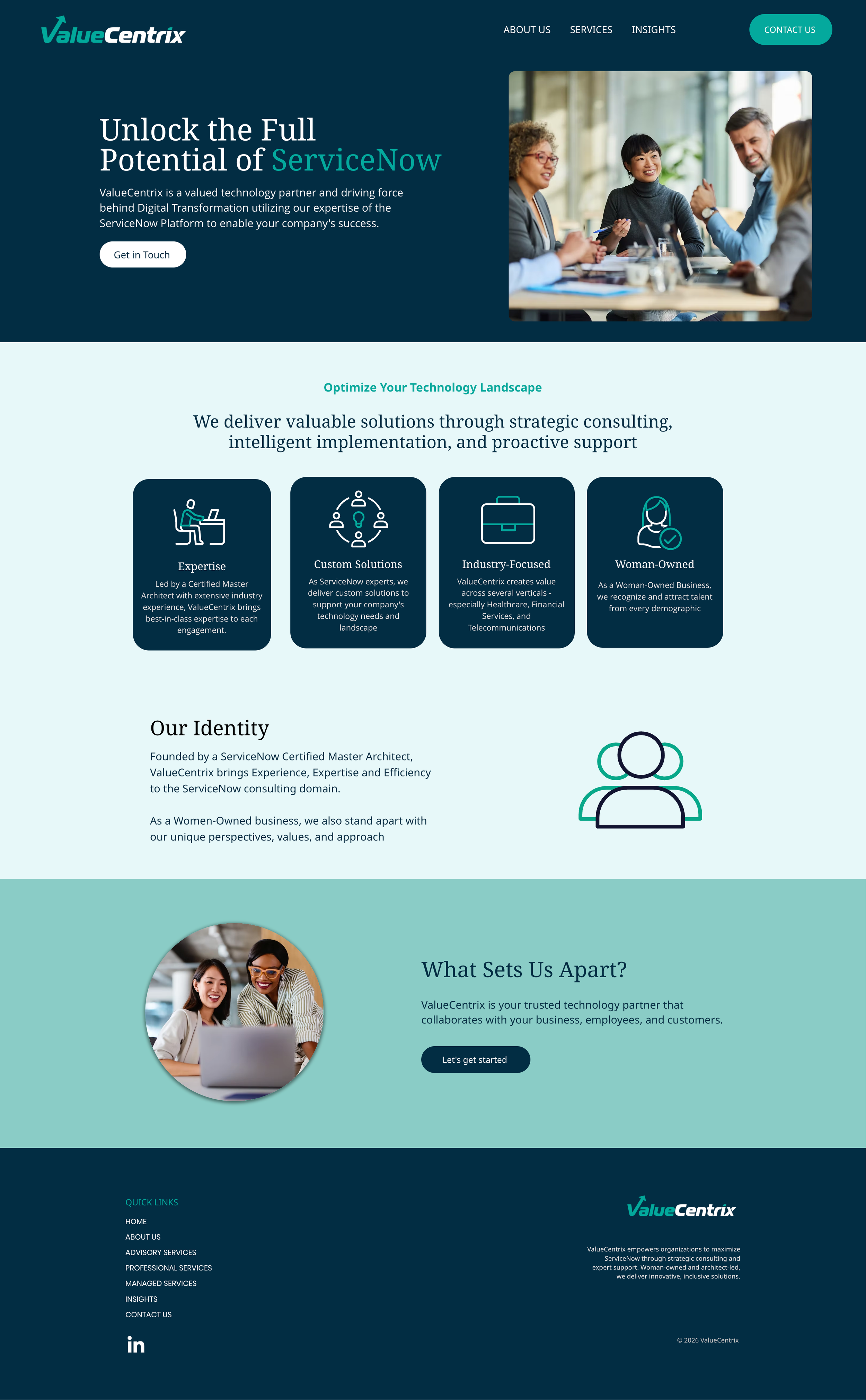
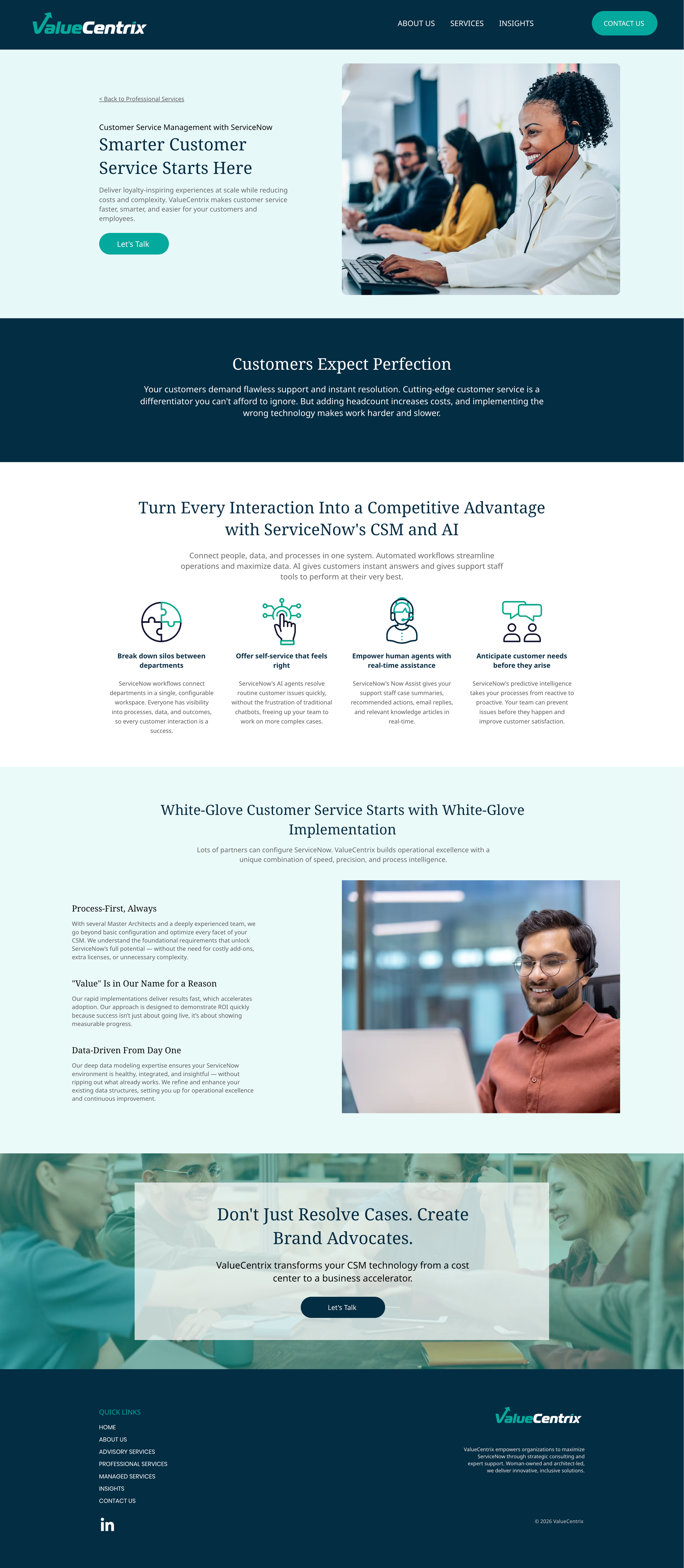
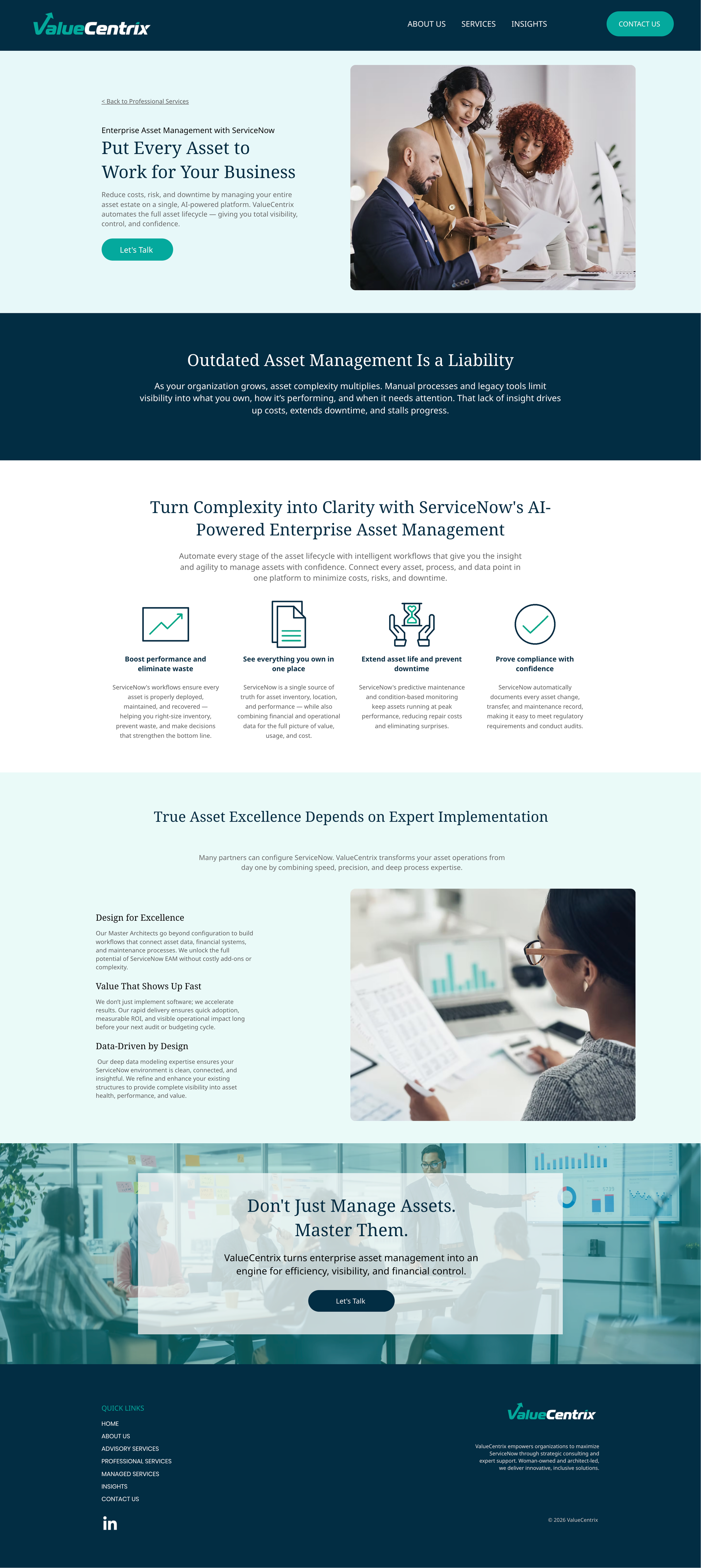
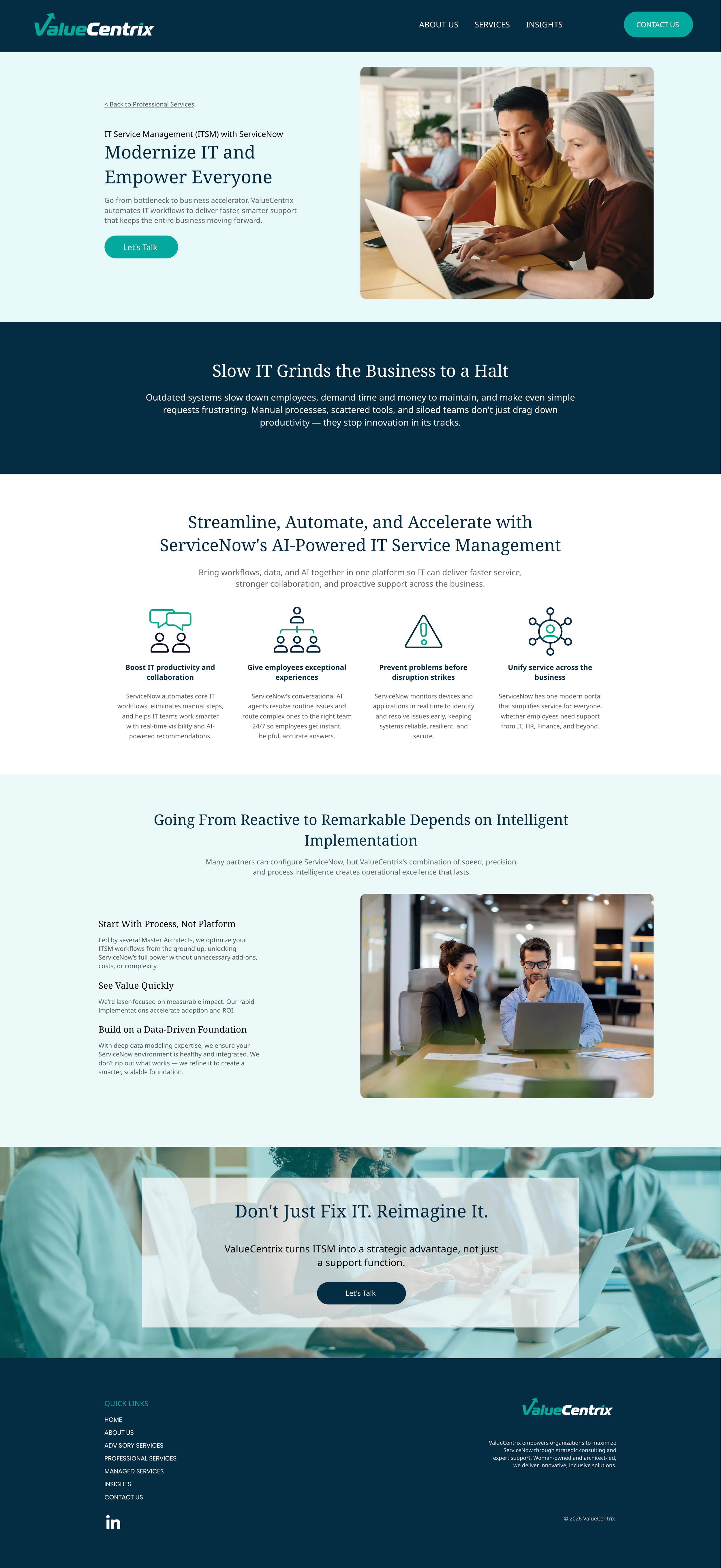
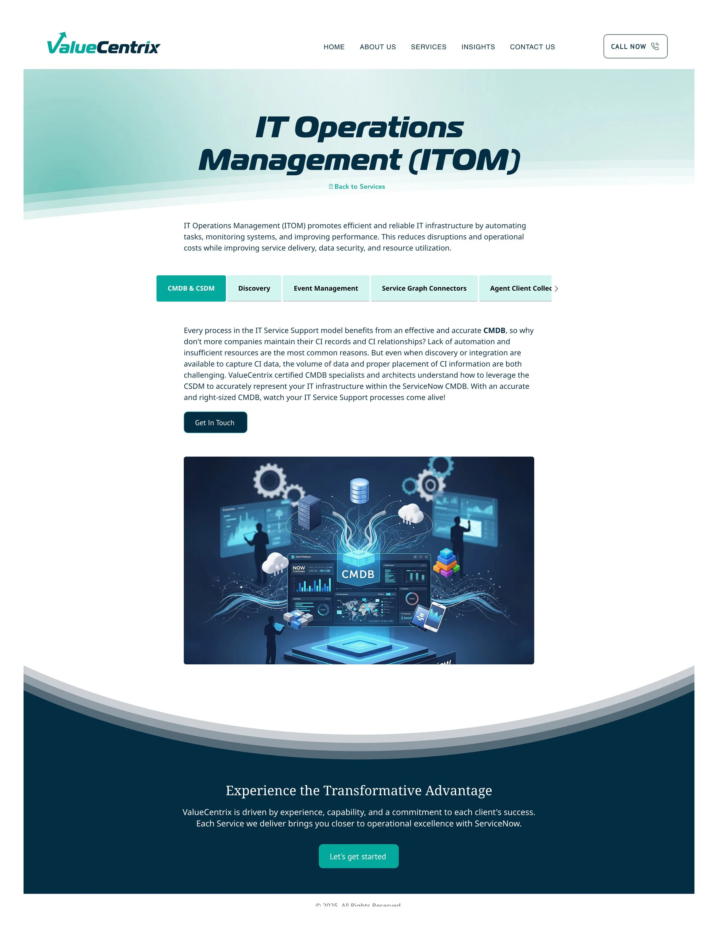
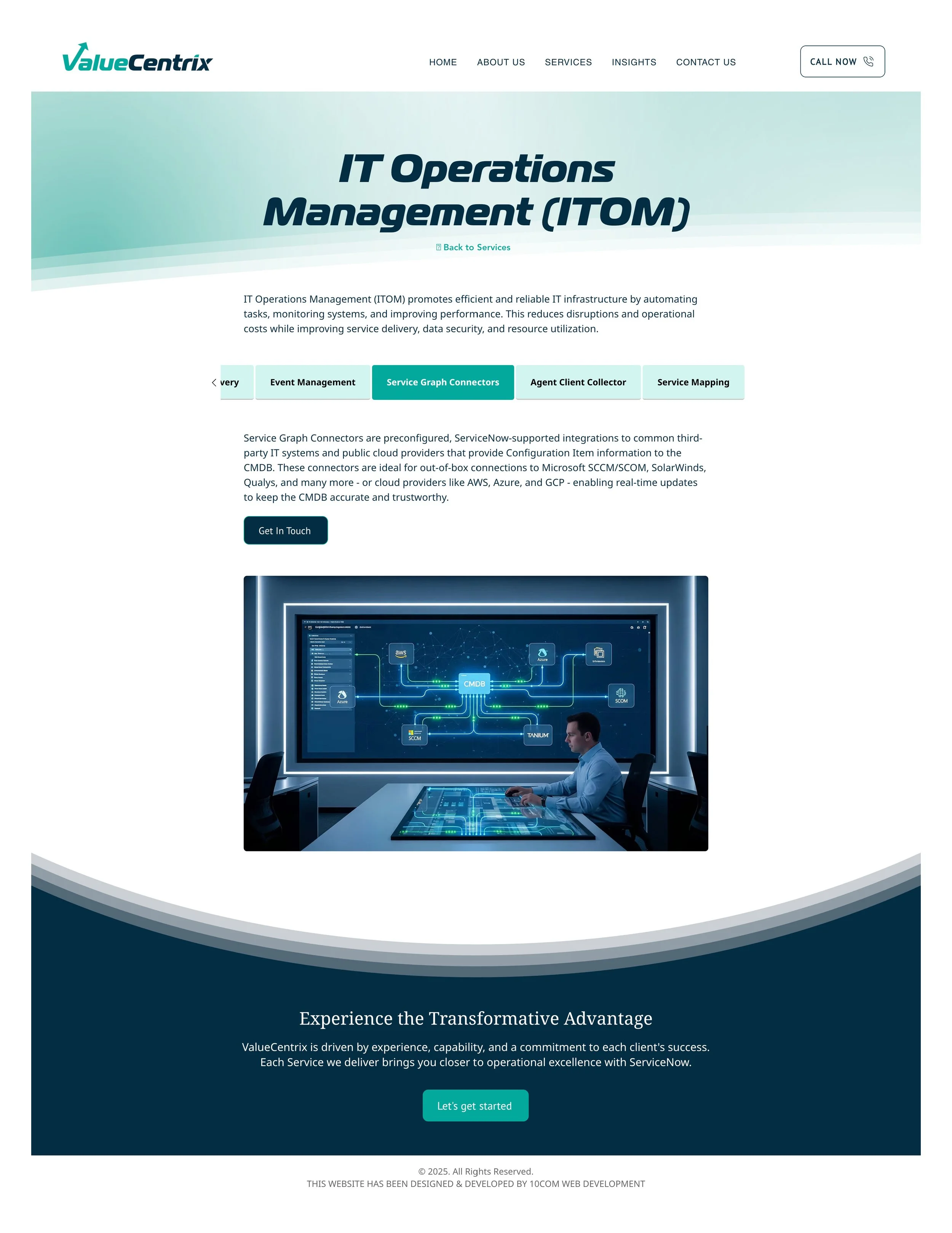
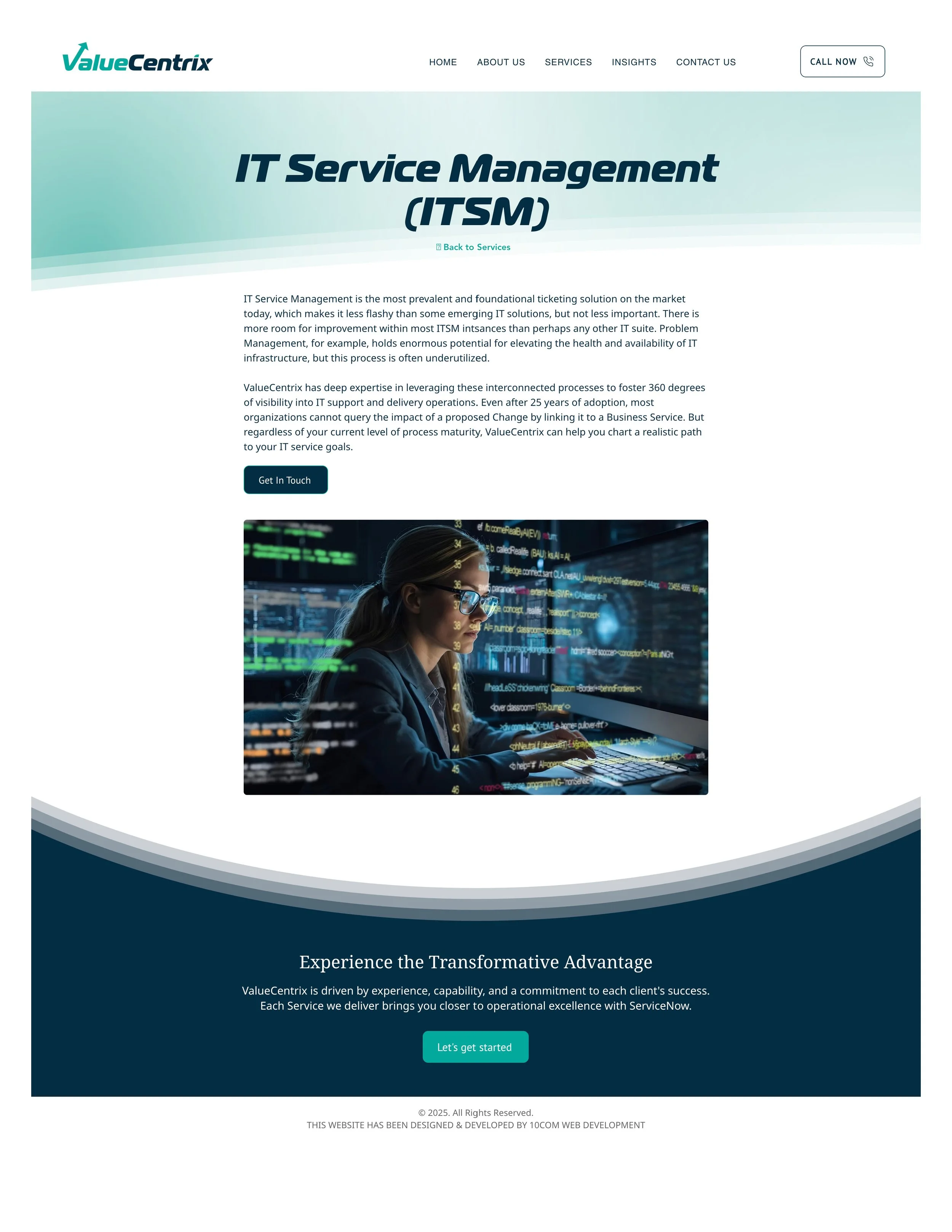
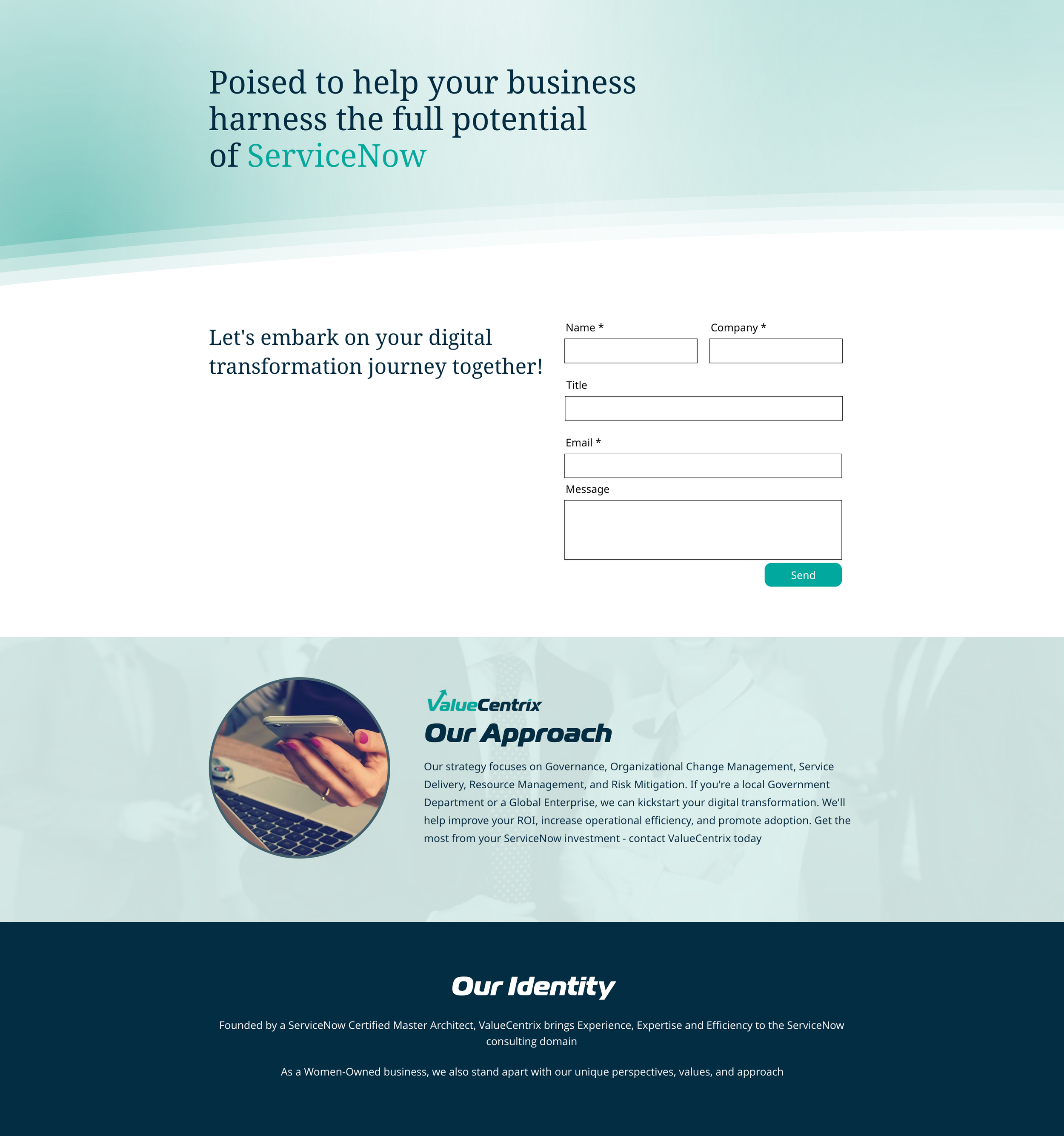
I simplified the font choices to Noto Serif & Noto Sans, Google fonts that are made to pair together. Removing the logo font as the heading font gave the site an immediate modern, cohesive feel
I chose to go to a darker color tone for the site - swapping the use of light and dark colors - to give the site an immediate “refreshed” look
Reduced the number of items in the navigation bar and removed the “call” button. Calling is not appealing to users as a mode of contact. With more content there could be reason to add items to the navigation bar, but at the moment this was all that was need.
Used a subscription-based icon library so the client could continue to grab icons after our project was done. The icons can be customized and exported in many ways, including as html so interactive animations could be used
Add small moments of interaction on the home page to make the page more engaging
Created a more professional footer that can help users navigate the site
Created consistent layouts with consistent design elements like rounded corners
Designed more appealing CTAs
I wrote a blog on the benefits of a “web refresh” for clients with smaller budgets and less time. Read more here.
Before
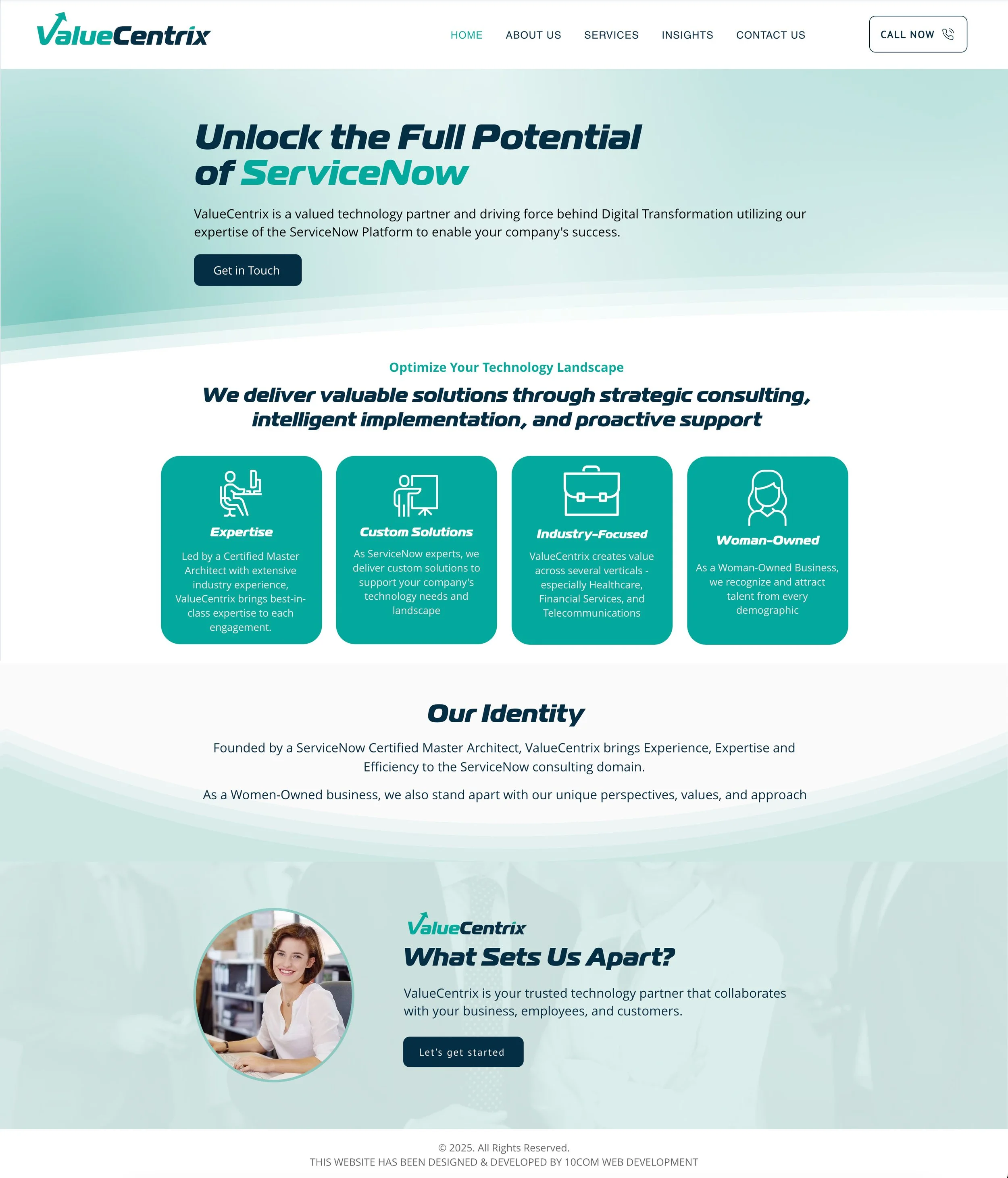
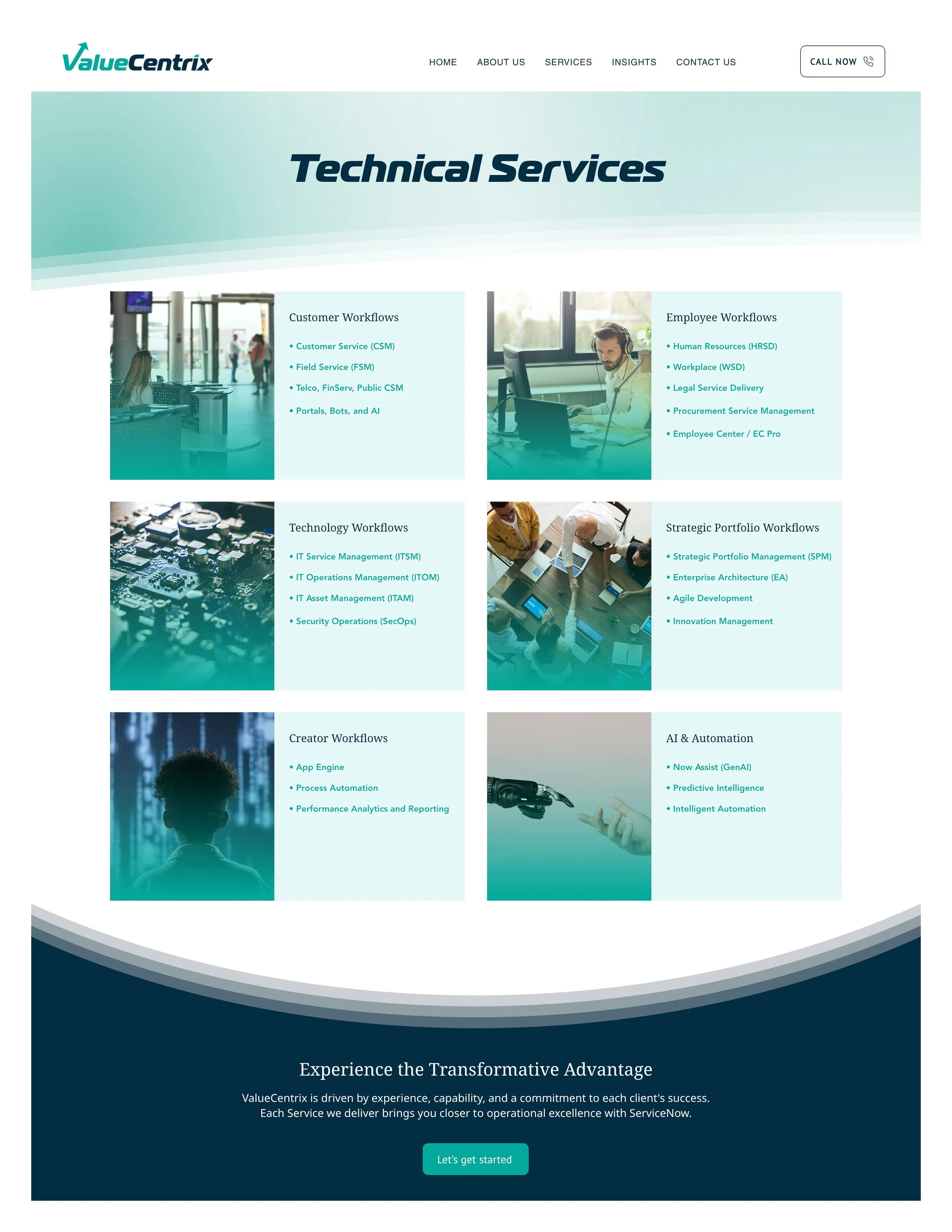
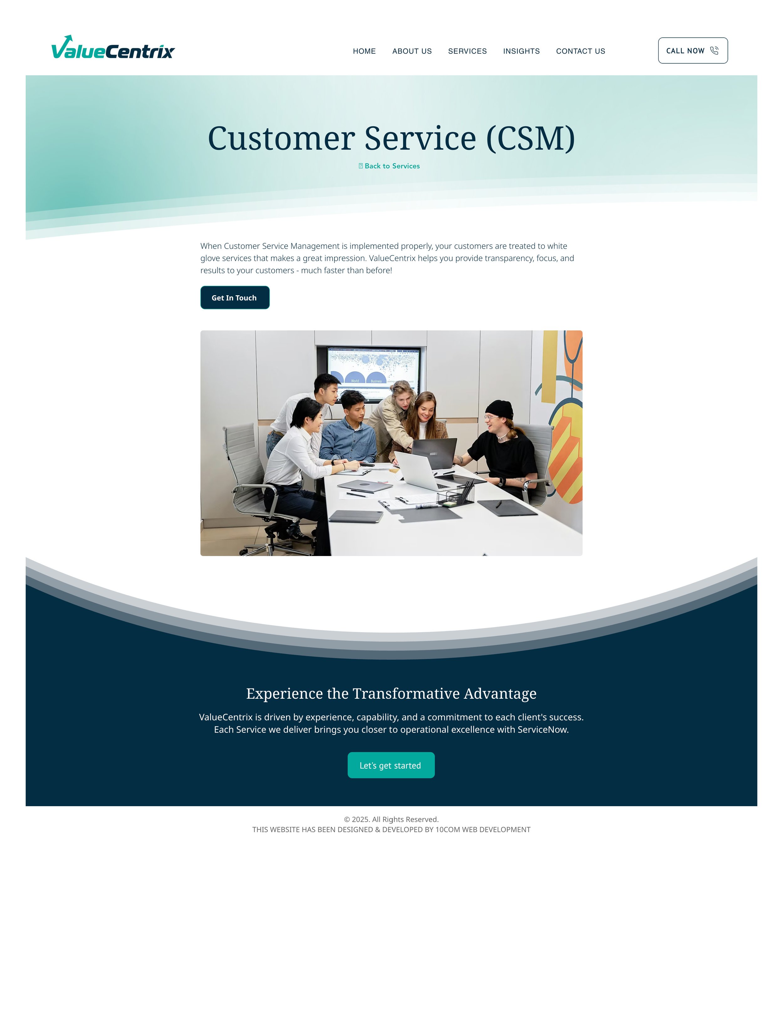
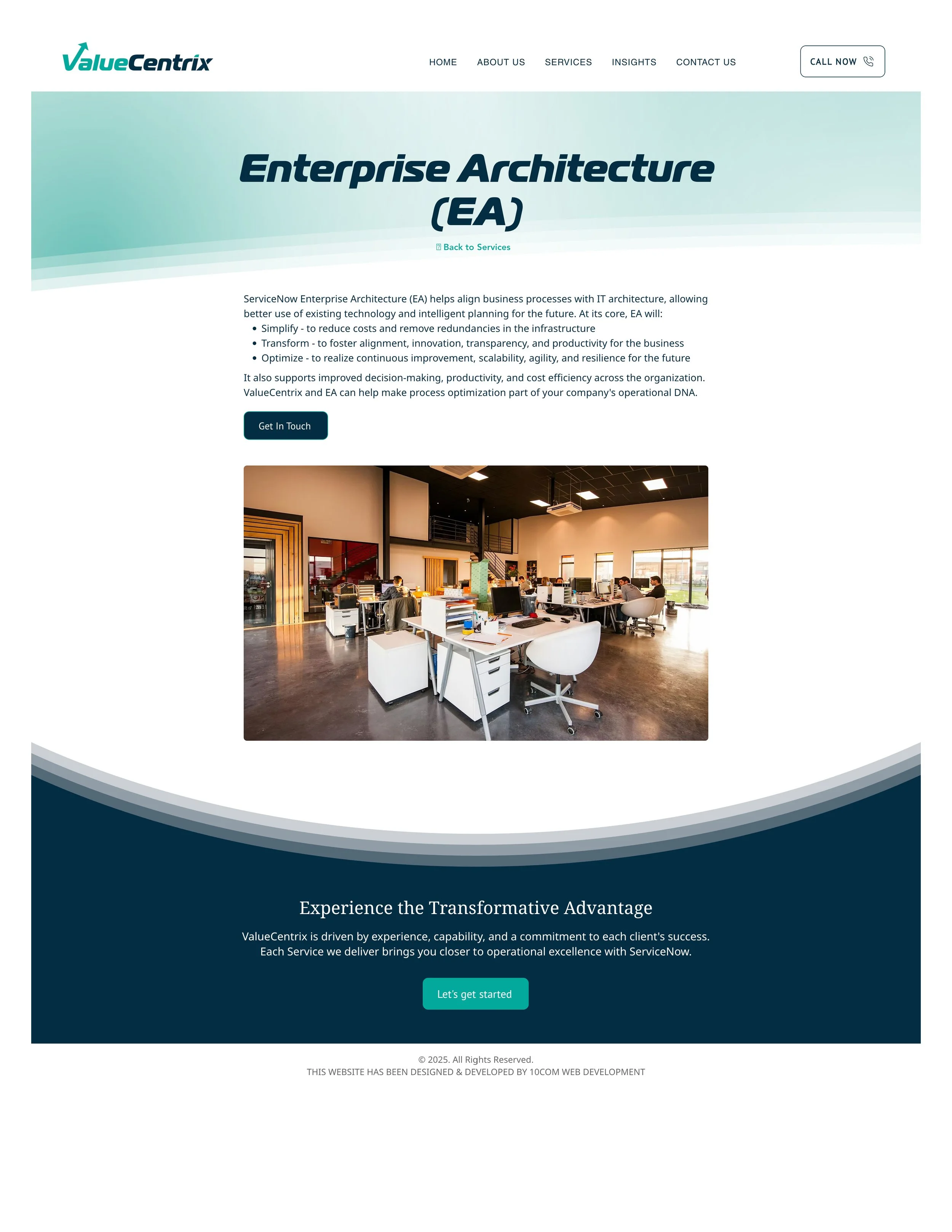
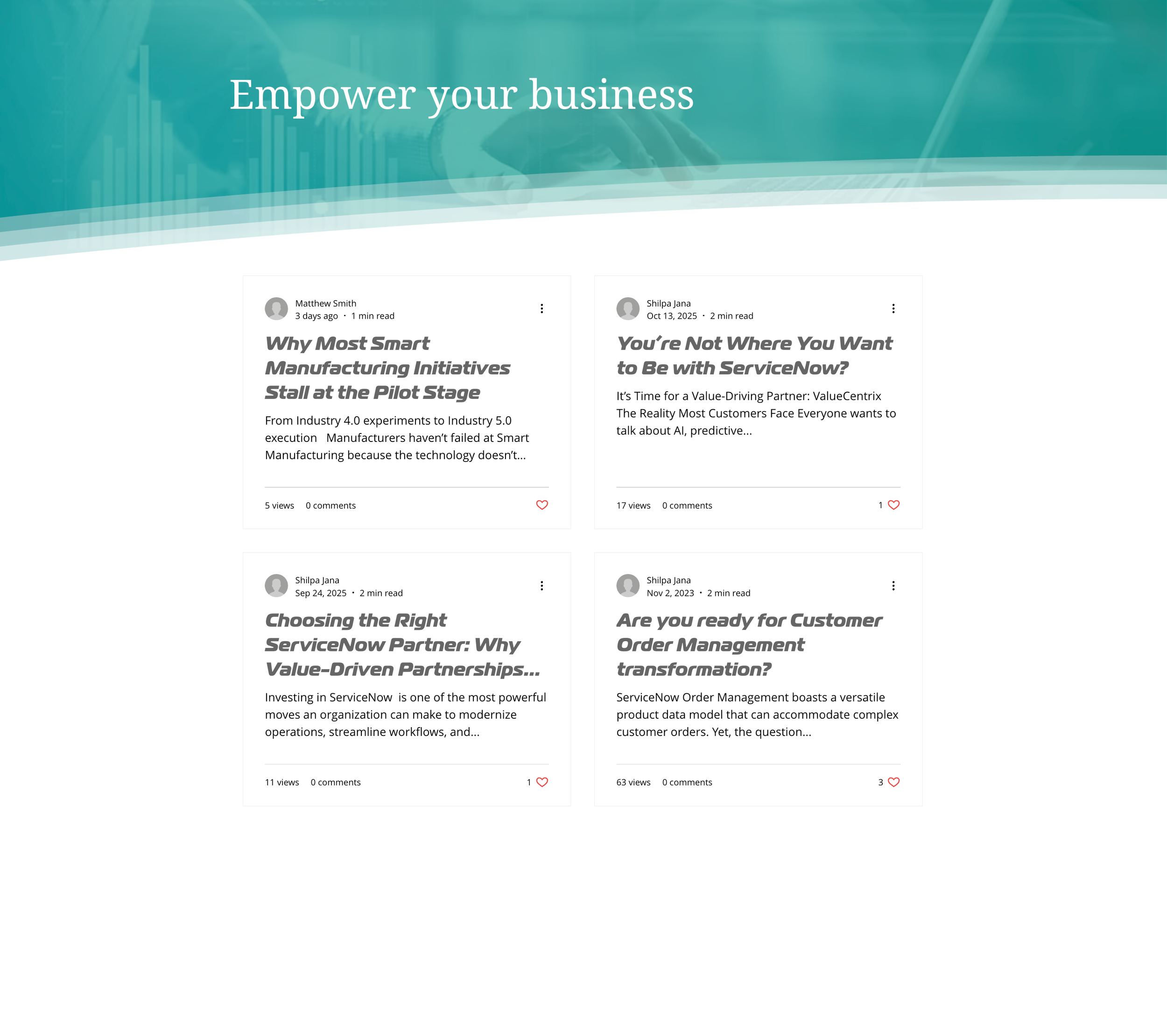
AFTER
See the design live with interactive elements here.